
Created on 99designs by Vista
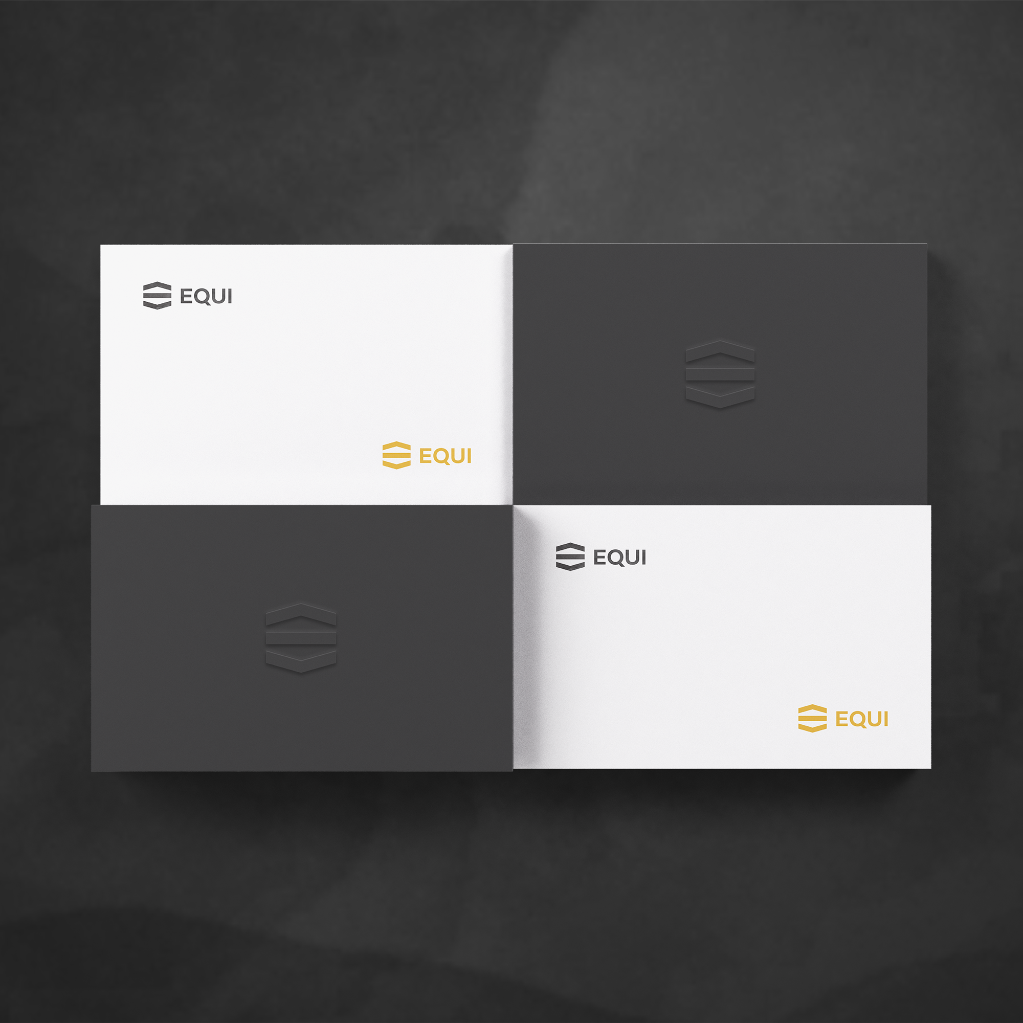
EQUI for "The equilibrium"..
The equilibrium is reached exactly between the two arrows pointing one up and the other down.. the symbol remind also a letter E. The font used is a result of a mixture of the early sans serif and the modern trends of our era. Its rational structure is subtly wider than the majority of the first sans, generating a higher impact in its uses.