Created on 99designs by Vista
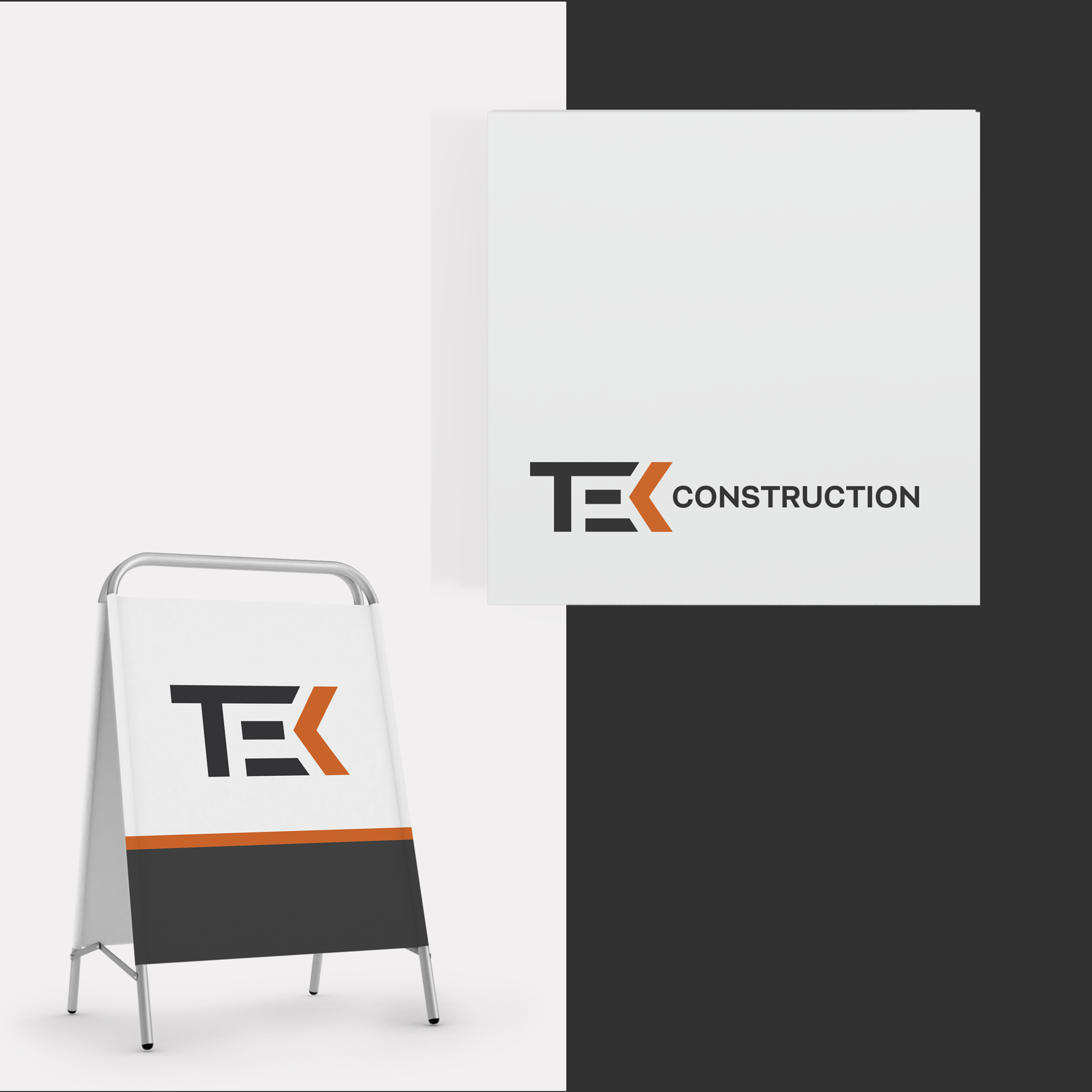
A simple customized word mark .. I avoided to use mountains and cows, preferring a more essential style .. dry, minimal, basic, where the letters are all hand made, and symbolically represent a geometrical "construction", with a technical appeal. Around the 'deep orange' sign (a strong accent) which is the K but is also an arrow can be made a flexible logo compositions that allow for a customizable identity. This is the main color and can represent the institution. A panel of secondary colors can be made to establish to allow maximum functionality while maintaining overall consistency.
