
Created on 99designs by Vista
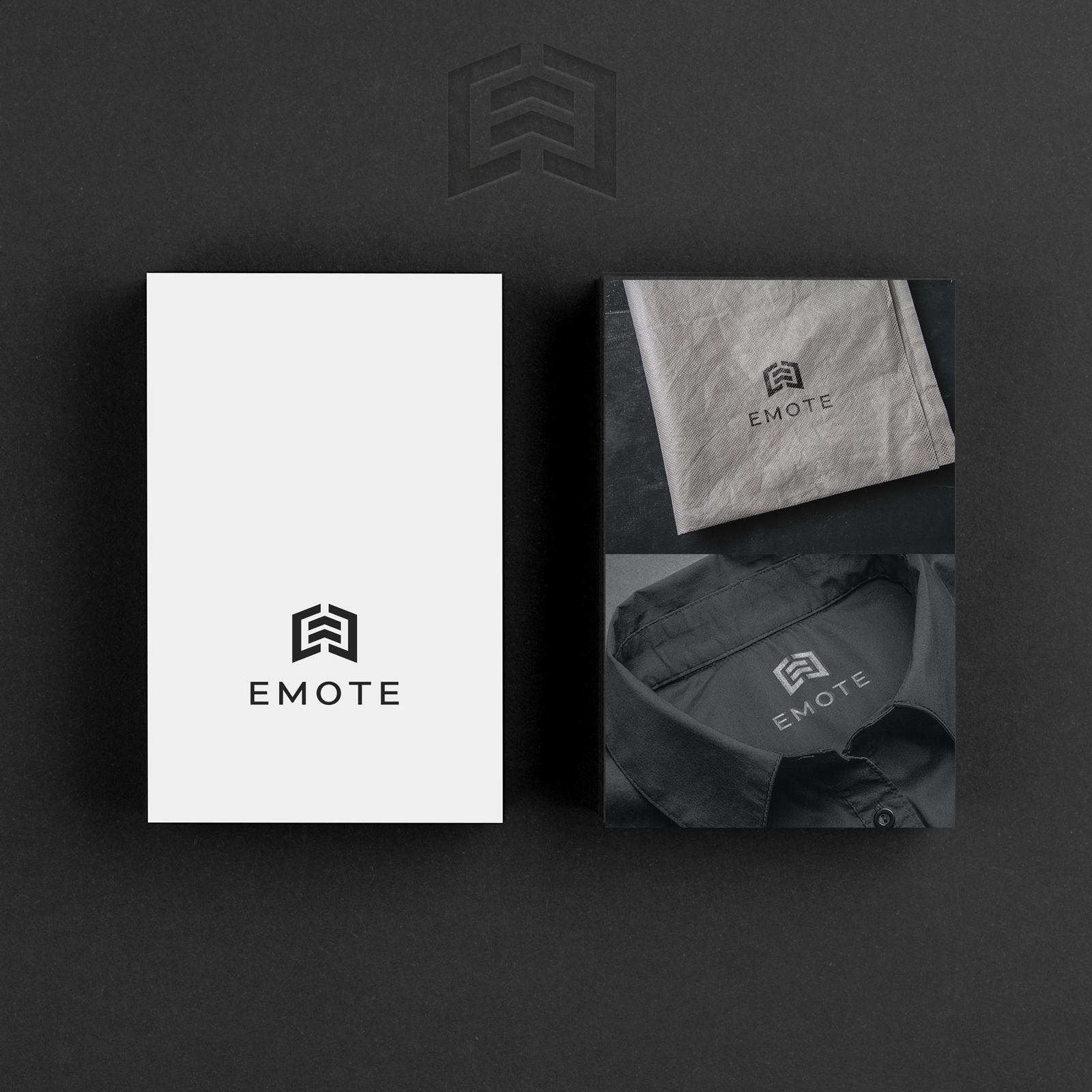
E for EMOTE. The letters E opposed to each other to express greater strength, are in the negative space and form a symbolic arrow, a flight, or simply a pointer upwards as a sign of positively, of something that wants to rise. The logo is a strong, decisive, minimalist and modern sign... It is contrasted by a simple but well proportioned font that sweetens the decisive line of the logo.