
Created on 99designs by Vista
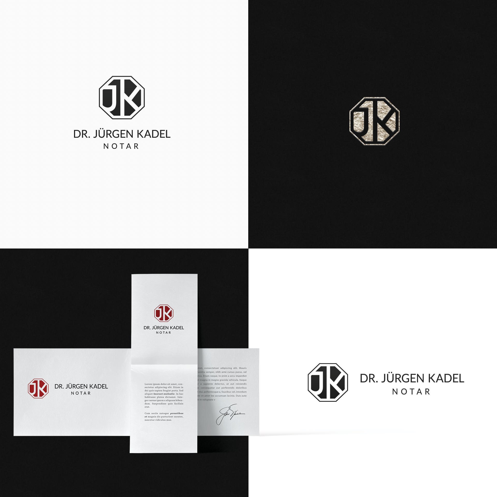
A simple minimal monogram with the customized letters JK. The design is simple and clear but also distinctive. It is definitely a frills-free design.
A mention on why I made an octagon for a law firm:
First "Eight" is universally the number of cosmic "equilibrium", and particularly the octagon is the beginning of the transformation (of the square into a circle and vice versa)... and then, just out of curiosity, in the symbolism of the Tarots, the number 8 card is that of Justice. The logo becomes an "emblem" almost as a heraldic device. That expresses its professionalism also on its own. And it alone maintains its uniqueness even without the lettering.