
Created on 99designs by Vista
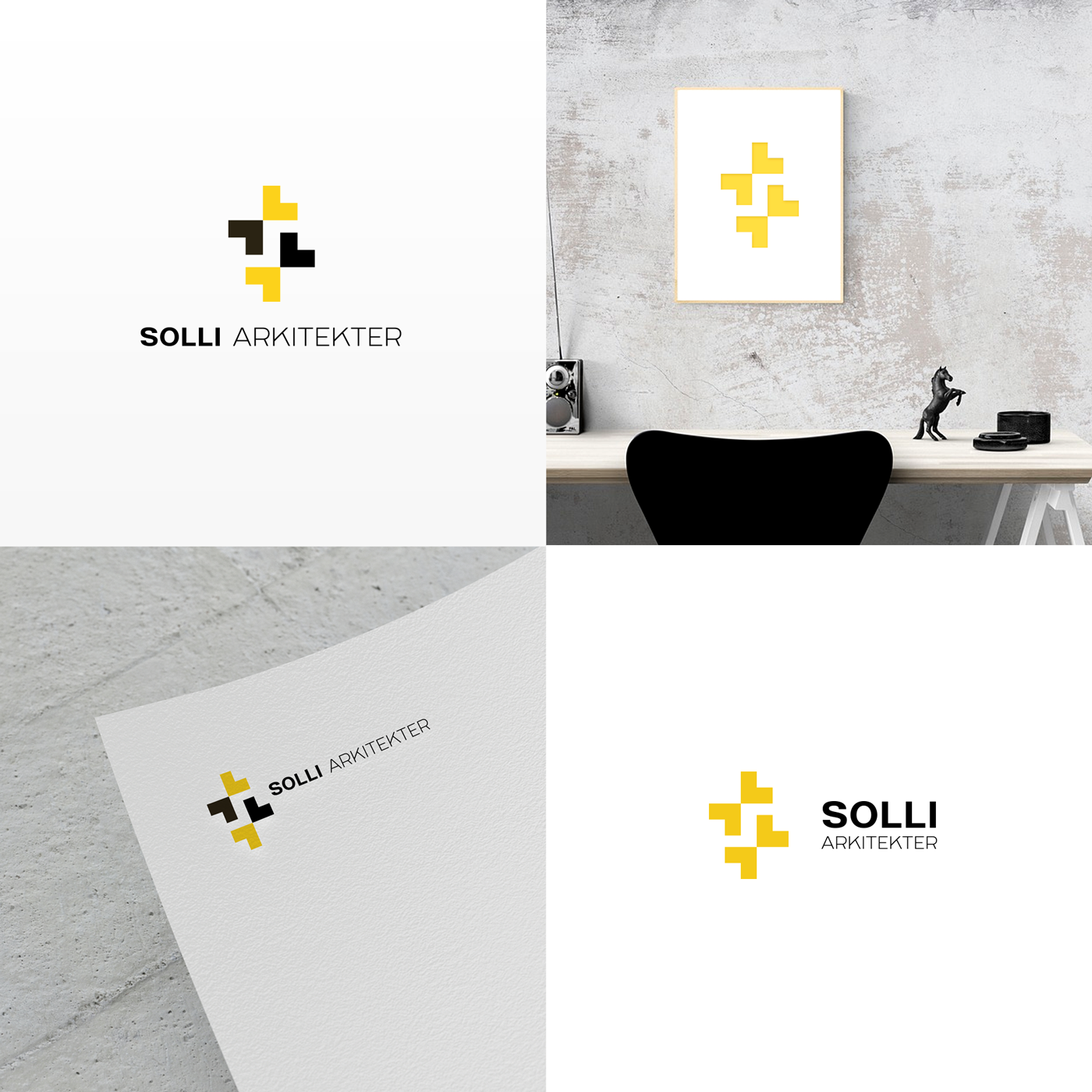
The S for the initial of the name is in the negative space formed by the tips of the stylized pencils (evolution of the pencil concept present in the actual logo) that are set against each other. I opted for a typeface that has a slight "Bauhaus" style and which is suited to the minimalist style of the logo.