Logo concept for Riverfront Wellness

0
Created on 99designs by Vista
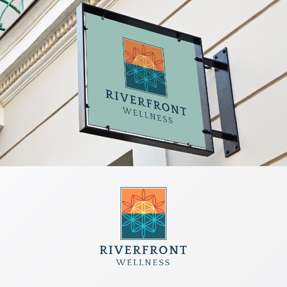
For the "Wellness" aspect of the logo, I researched some examples of sacred geometry (see Da Vinci's Flower of Life). I felt that having a river winding through the logo might be overkill, so I created a reflection for the lower half of the logo instead. This inadvertently produced a sunrise-like effect. The client wanted to avoid using marijuana leaves, and I couldn't agree more. But it does create a challenge in regards to easily identifying the industry. I think the flower of life provides a good compromise.