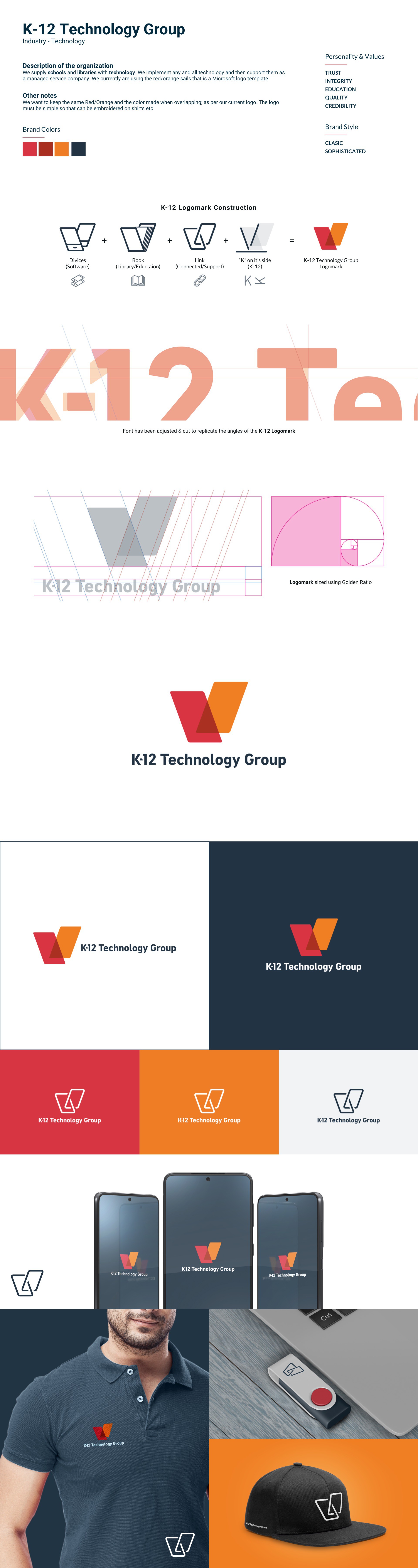

This client supplies schools and libraries with technology and implement any and all technology and then support them as a managed service company.
The Brief was to revamp their current logo while keeping it similar. The client wanted the same 3 colours in the current logo but wanted it refined to be simple - The logo will be used for embroidery and printing.
I choose rectangles for the "sails"; the shape signifies Reliability, Efficiency, Professionalism, Trust, Credibility & Stability - This works hand in hand with Technology & Support
I used the "K" from K-12 and turned it so it would resemble an open book.
Being Rectangles, this also signifies "devices", the Typeface/Font was adjusted to replicate the angles of the Logomark for consistency - - all explained in my image.