
Created on 99designs by Vista
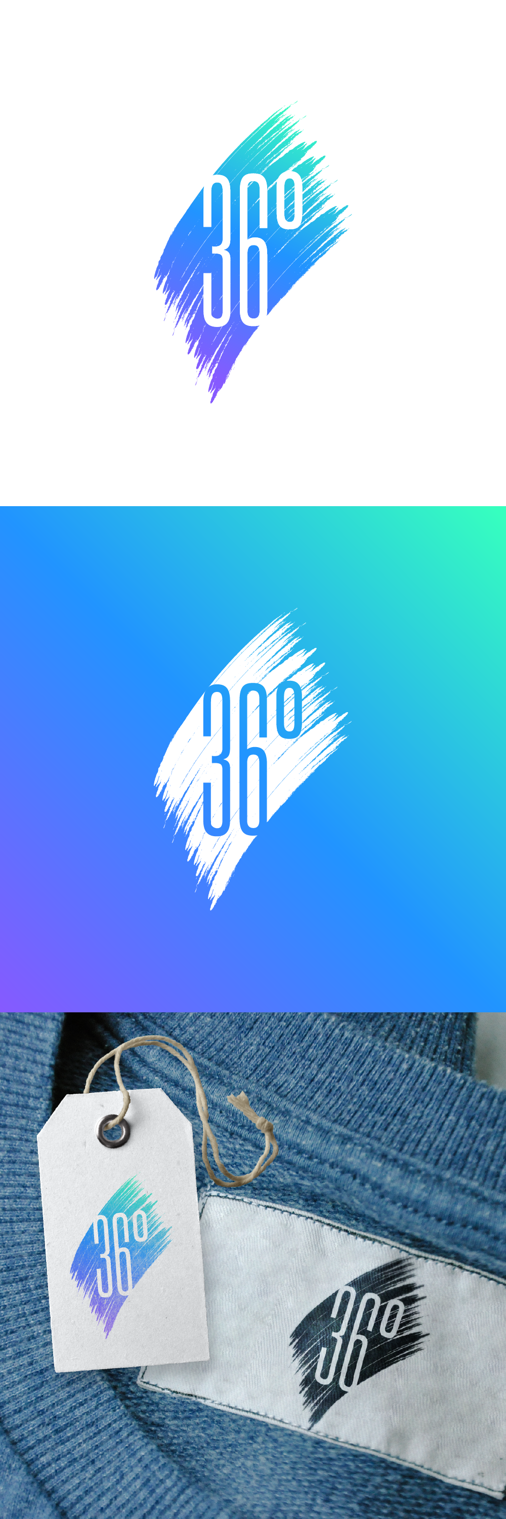
The customer wanted a colorful design, nothing boring, so I decided to go with a style that is unconventional for organic products, uses bright colors and will be easily recognizable.
I used a clean font in the combination with brushstrokes (in 36° :)) in the background. Also it was important to me that the logo doesn't lose any of its character in black and white - I added an example of how it will work in one color as well.