Clean and simple chick for a baby-company

3
Created on 99designs by Vista
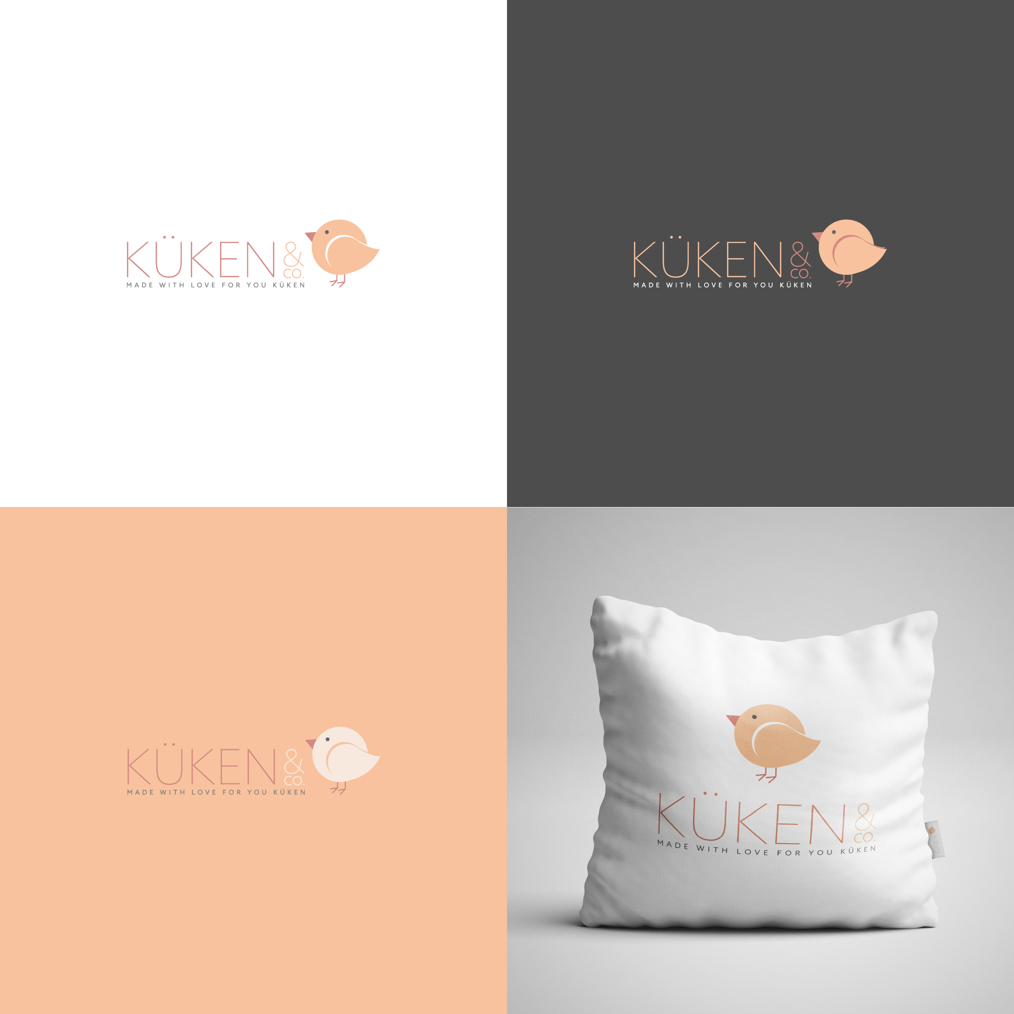
I created a little chick out of geometric shapes, it's very soft and childlike. To make the logo not too childish I combined the bold chicken with thin and clean font.
The typo is clean enough to give the customer the feeling of trust, although the chick makes sure that it's still a baby-product.