Bold logo concept for a new FinTech start-up

0
Created on 99designs by Vista
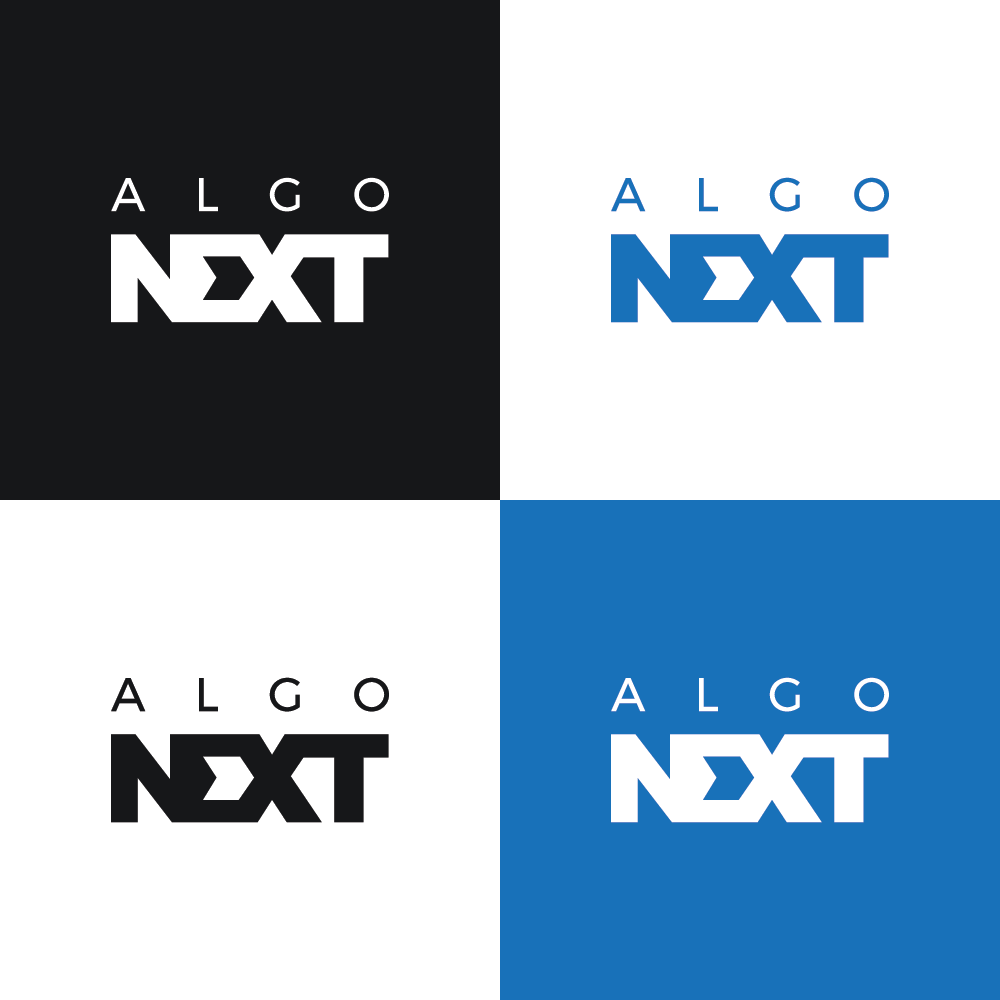
Algonext is a new FinTech start-up who wanted a modern, solid, masculine yet calm and trust-instilling brand identity. The idea was to go all out with modernism and minimalistic typographical styles.
The word "Next" stands like the foundation of a structure or a large entity. The "E" in the word "Next" uses a modified tine that creates a geometric arrow in the negative-space signifying "forward", "moving", "next" and because of the triangular tine, it also makes the letter "E" resemble the Greek letter "sigma" - a rather important symbol in Finance. The word "Algo" sits atop "Next" in a typographically sound and aesthetically pleasing manner with an understated, "corporate" feel to it.