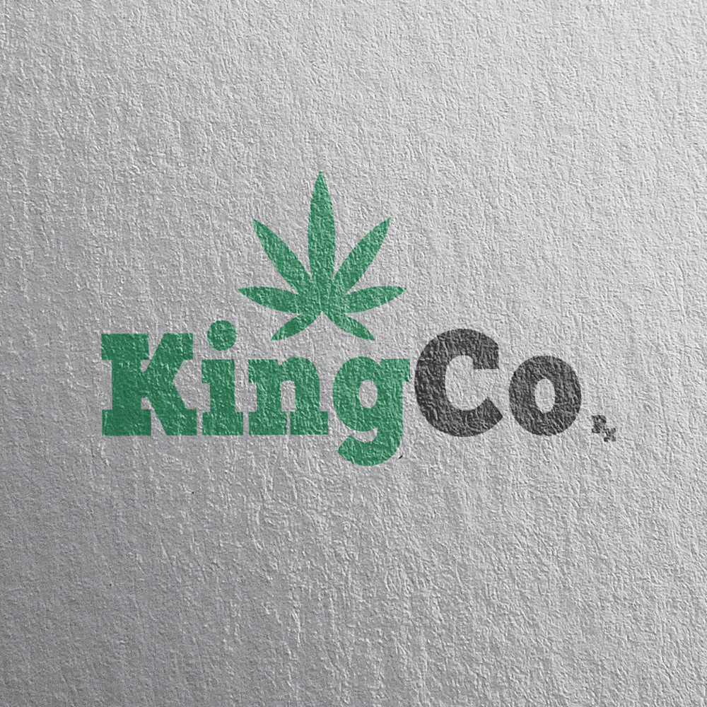
Concept Design for Marijuana Dispencary
1
Created on 99designs by Vista
Had a go at creating a logo for KingCo, a medical marijuana clinic in California. Biggest challenges were trying to incorporate a crown into the design, while at the same time trying to convey this logo as a medical marijuana fulfillment center. Instead of adding a crown, I thought of using a strong, and bold font, a font fit for a king. The marijuana leaf was extremely important. I wanted to make sure everyone knew what to expect from a business with this logo. Since I had such a bold font, I needed to find color that were soft and easy on the eyes. I couldn't just fill it with a deep green, I needed something softer, almost pastel like. The results speak for themselves.
