
I love combining more elements in logo - not too much, just enough!
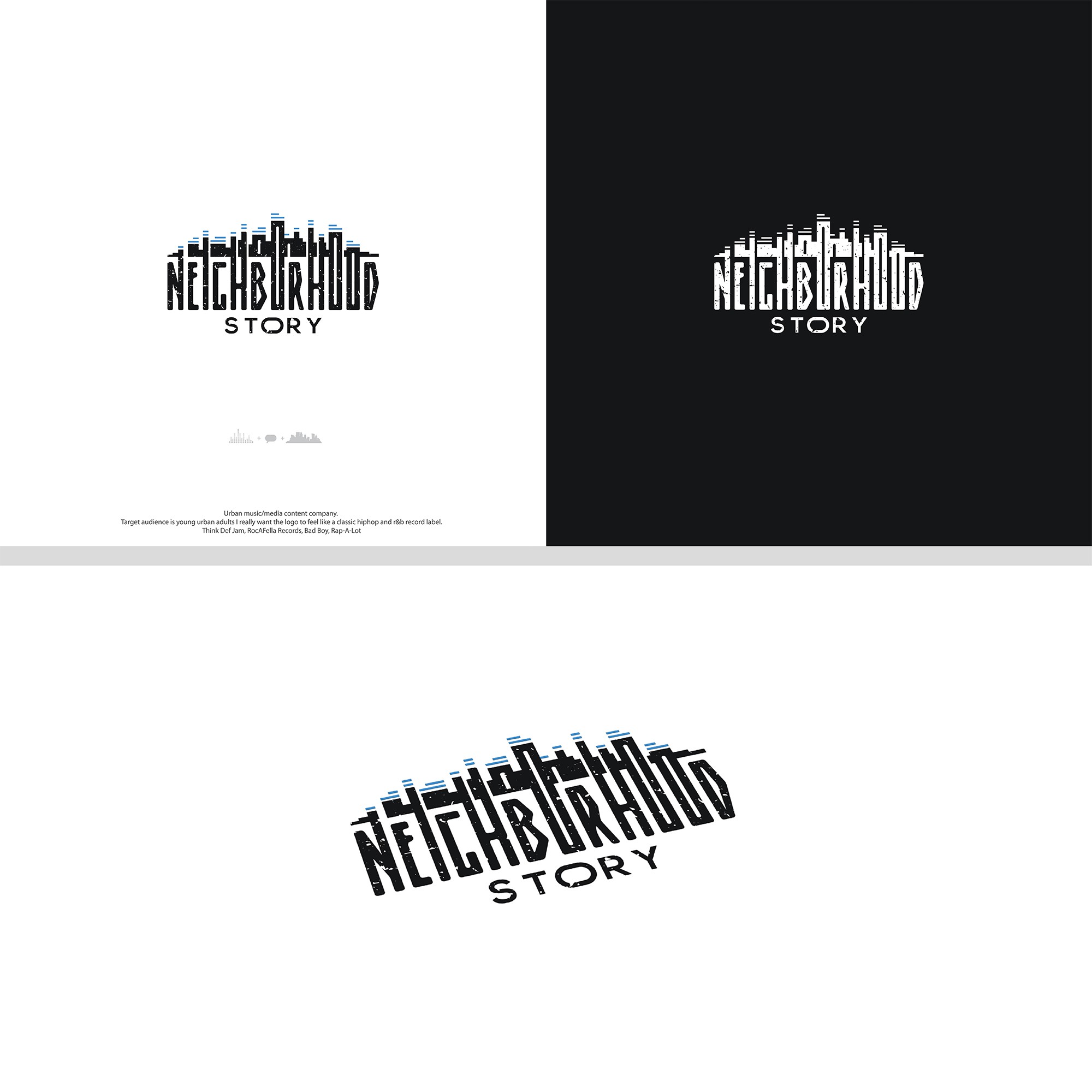
For me, when you say "neighborhood" I can imagine sort of a skyline with buildings and landmarks of my hood.
As I was looking at the word itself, I made a decision to extend vertical lines of some of the letters and by adding a few rectangles in between I created the skyline. As I was doing that, I was looking for opportunity to implement some elements of music (since it is a nature of this company). While listening to music on my headset I was stretching the rectangle to make one of the buildings. I sort of puled it up and down in the rhythm of music - just like music equalizer!
So I've just put more rectangles on top of the buildings to represent just that, like the Urban music was playing in the Hood!
In the word "story" is a speaking bubble hidden inside a letter O.