Bold logo for a plastic surgery clinic of aesthetic medicine.

1
Created on 99designs by Vista
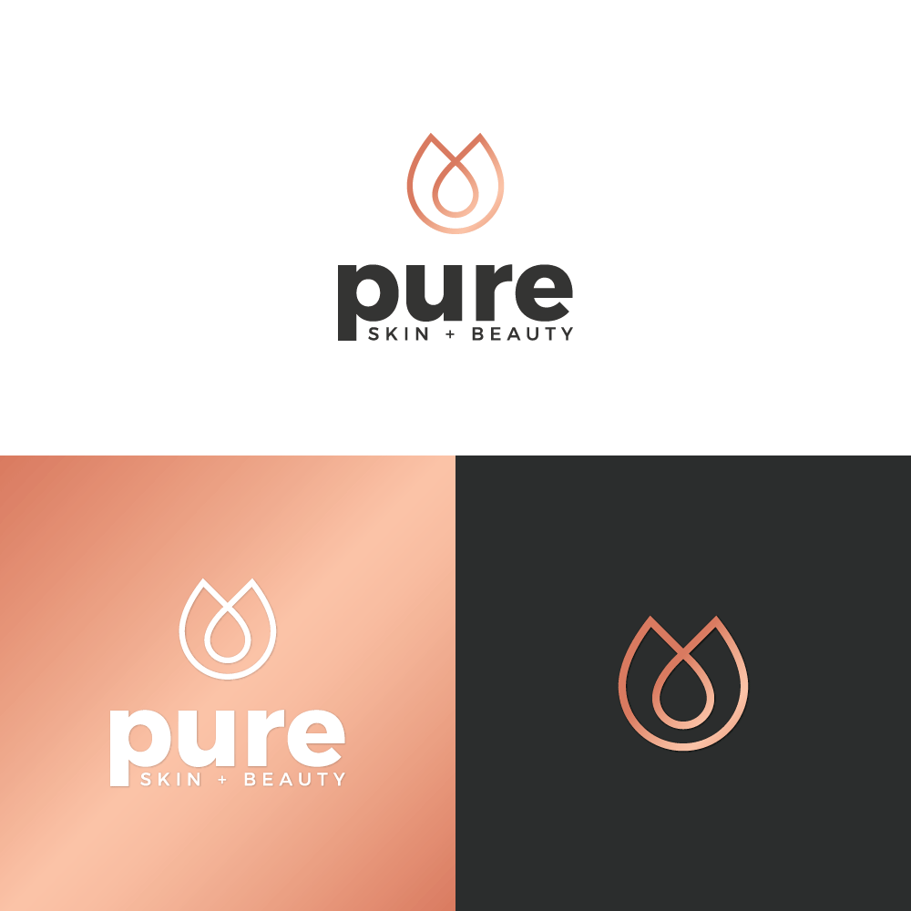
Here is a modern and bolder take on a logo. The choice behind the logo symbol was inspired by softer round shape, feeling of beauty and feminism. The color is contrasted between dark grey and rose gold to appeal to feminine target audience of all age range. The purpose behind rose gold is also to give logo more lux and upscale feeling. The typeface is strongly contrasted between bold, powerful lowercase name and thinner uppercase subtitle. The choice for this logotype is a reference to being a modern and professional clinic.