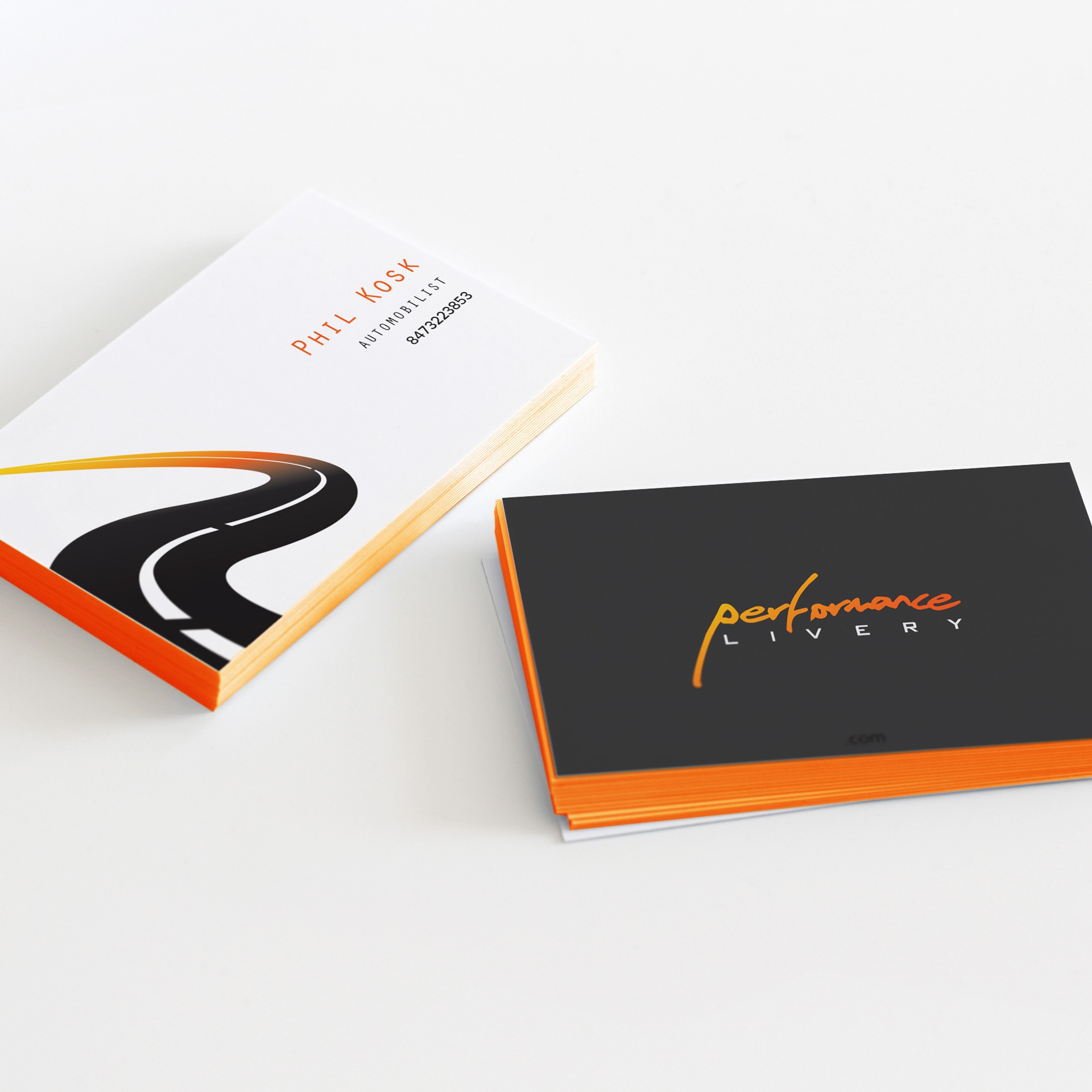
The main idea was to use the initial "P" letter to create a shape that would relate it to the company directly. So the icon result in a "Highway P"