
Created on 99designs by Vista
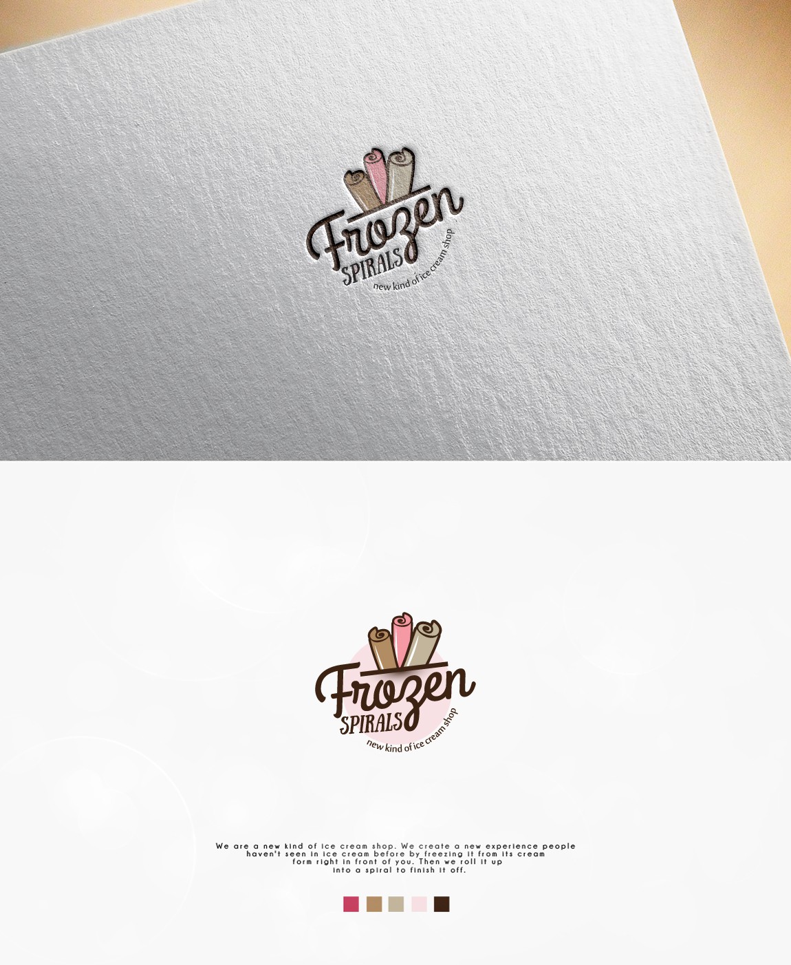
The CH's idea was to create a memorable and not too feminine icon that will be eye catching for the kids and their parents, so I created circular logo with text and graphic of the ice cream spirals included, soft colors and cursive lettering. With a few tweaks, at the end I succeeded to create final logo that the CH really liked, and it the whole process of creating it, his feedback meant a lot.