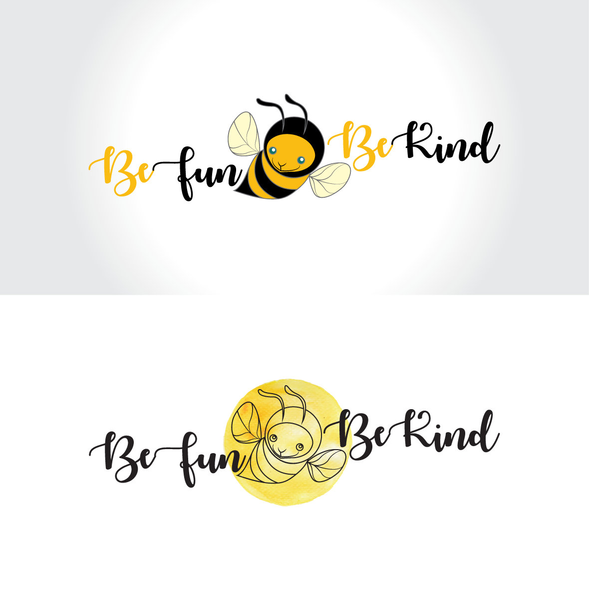

This BeFun BeKind logo concept explores the playful and warm character of this organization, both through the mark and the font used here. The image of the bee, placed in the center of the logo, represents the connection, the binding between the written elements and between these elements and itself, thus giving the whole – the logo – a unitary character and reflecting community through relationships between people. I tried to illustrate here the flexibility and adaptability of the logo by showing it in two distinct possible ways of presentation (with the bee in full color and, alternatively, only in line and highlighted by a textured drop of color), illustrating at the same time how the logo’s personal, distinctive character is preserved beyond the possible ways of its usage.