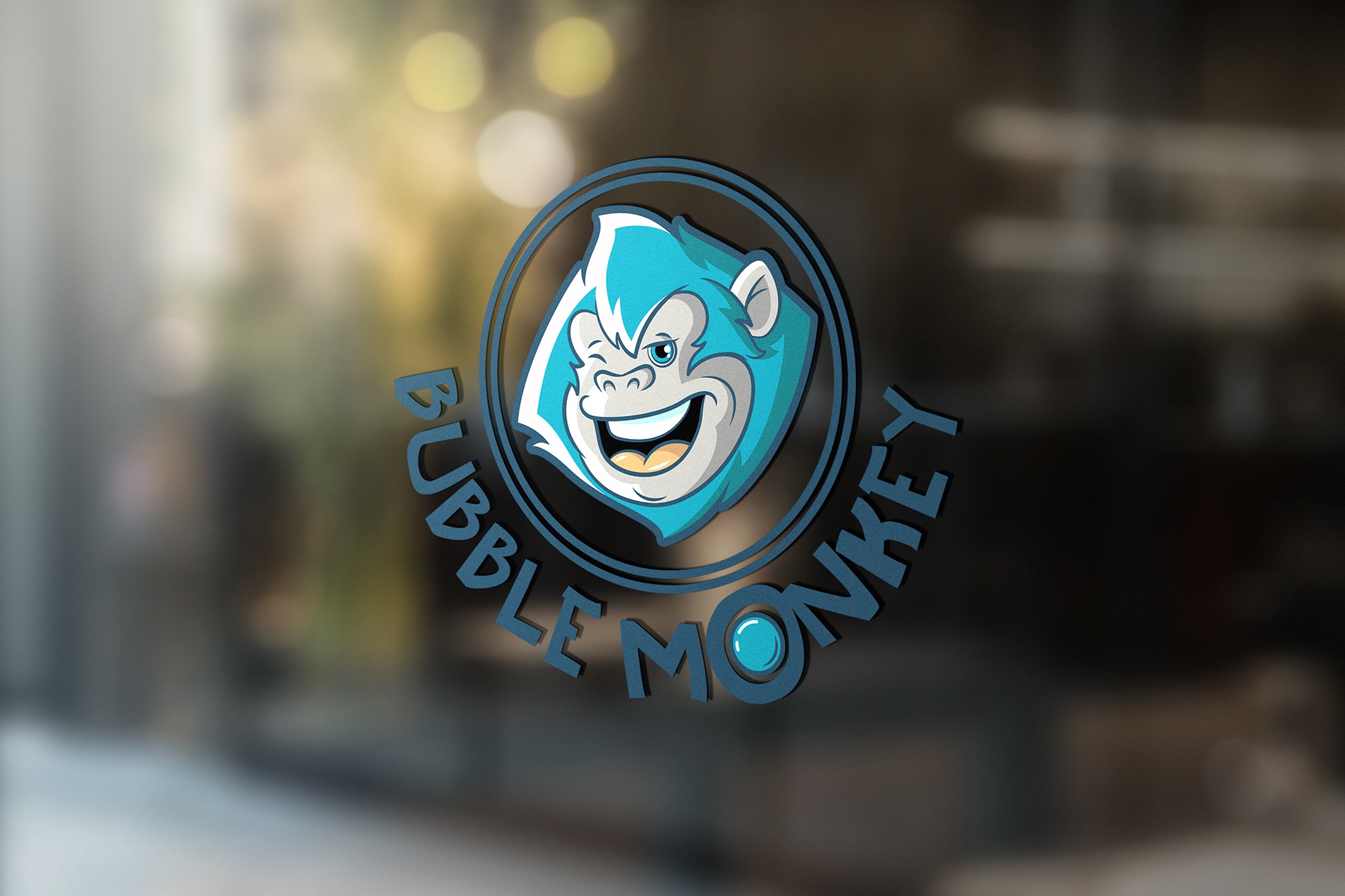

This design was created for a bubble waffle place. The client wanted a representative mascot, full of character. . I wanted the logo mark to be expressive and original, so that it could become the distinctive mascot of the brand, one that could stand alone and thus that could be used on its own. I used modulated, expressive lines in outlining the stylized monkey and aimed at making it appealing to a large range of public. I used rich, vibrant, yet somewhat subtle color tints to make the logo pop up and highlights and shades to give it a bit of depth. The composition as a whole is a circular one, mirroring the shape of the waffles and their distinctive bubbles. I used a cool, dynamic font, readable from a considerable distance and introduced a bubble inside the O as a fun accent and as a way to reinforce the wording in the name, through image.