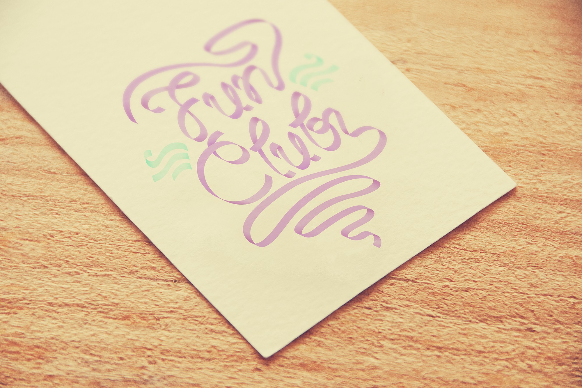

In imagining and creating the Fun Club logo, I tried to obtain a fresh and fun design, infused with a character, with a personality that I hope expresses both playfulness and integrity, both feminity and strenght, both sponteneity and reliability. I wanted to design a visual sign that is self-sustainable and self-explanatory, that can translate meaning through visual language and thus doesn’t need auxiliary elements, so that it remains uncluttered and clear and retains impact. To this end, I decided to create a typografic logo and give it a twist by making the letters in the form of pieces of ribbon; giving it this appearance allowed me to work with fine detail, while maintaining the visual unity of the whole. I also chose the ribbon because it is associated with feminity and because it is an excellent element to use in order to obtain the feeling of a flow, of lightness and dinamicity.