
Created on 99designs by Vista
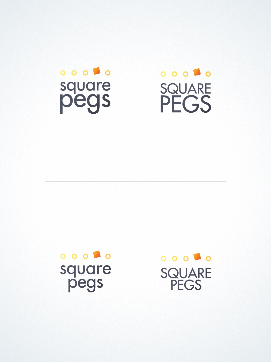
I based the logo from the expression "Square peg in a round hole". I lined the shapes horizontally to make them represent children in a line.
While the circles are outlined ( representing the holes ), the square is the only one that has a gradient foreground, rotated to a certain angle and placed a little bit higher than the circles. This is to put emphasis on it being distinct from the rest.
The square has a hint of orange in it to promote confidence and provide courage for the gifted to attain success.