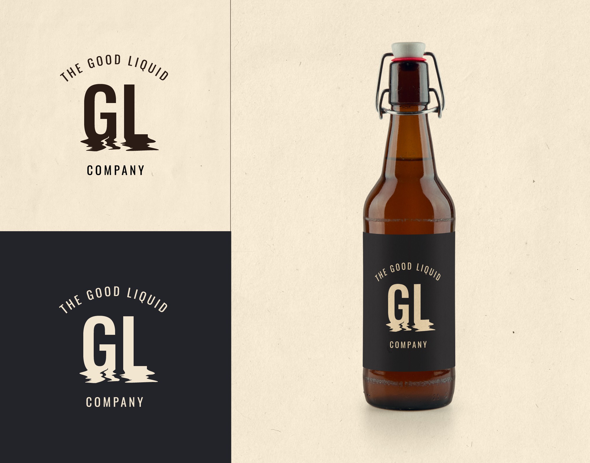
I played around with the letters G and L and liquefied them at the bottom so that they are still readable but they have an element that correlates them to the company's name.