
Created on 99designs by Vista
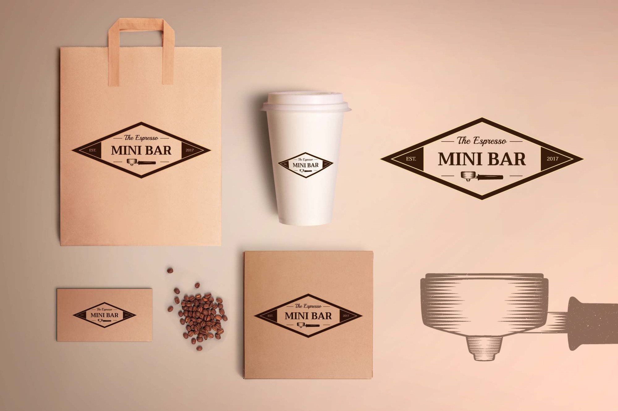
I created a badge-looking logo because it gives a retro look. The script versus the serif font makes the "MINI BAR" stand out, this being a request from the client. I drew a portafilter that looks a bit old and rugged and used it as a symbol for the espresso bar.