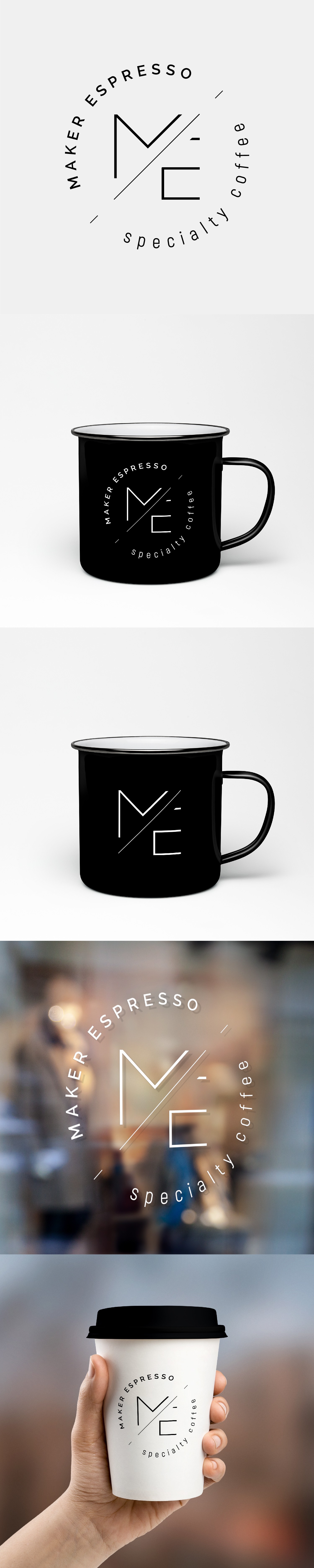
I used the lines from the letters M and E, going for something a bit more abstract. I tried making a simple and minimalist logo, using thin lines and thus trying to avoid a cluttered logo.