Logo design for philosopher, writer and editor

21
Created on 99designs by Vista
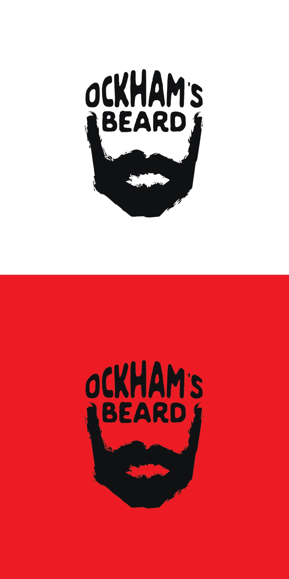
The idea is obvious (the use of a beard); but I wanted the text to relate in a way that implied the shape of the entire face. The CH wanted something cheeky and memorable rather than the usual "boring" graphics used in his field, so I wanted to create something really graphic and bold rather than a silhouette. The rough texture creates an effect that reminds me of a graffiti stencil - and that's an aesthetic I completely adore.