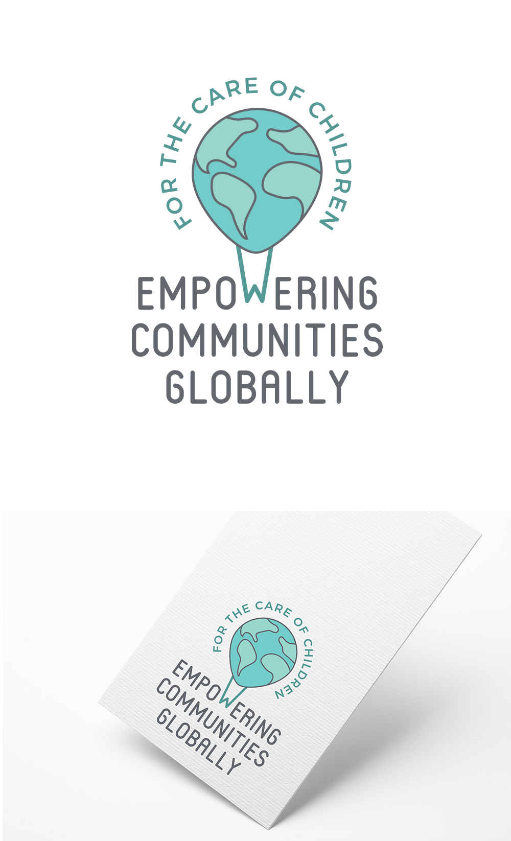
Logo design for children's non-profit
93
Created on 99designs by Vista
With an organization name and tagline as long as this, I wanted to create a solution that would be easy to read and understand at a glance. The "balloon/earth" with the org mission wrapped around it helped solve part of this problem. The interaction between the mark and the text is one of "pulling up"... representing both "global" work as well as "empowerment".
