Logo design for organic produce company

59
Created on 99designs by Vista
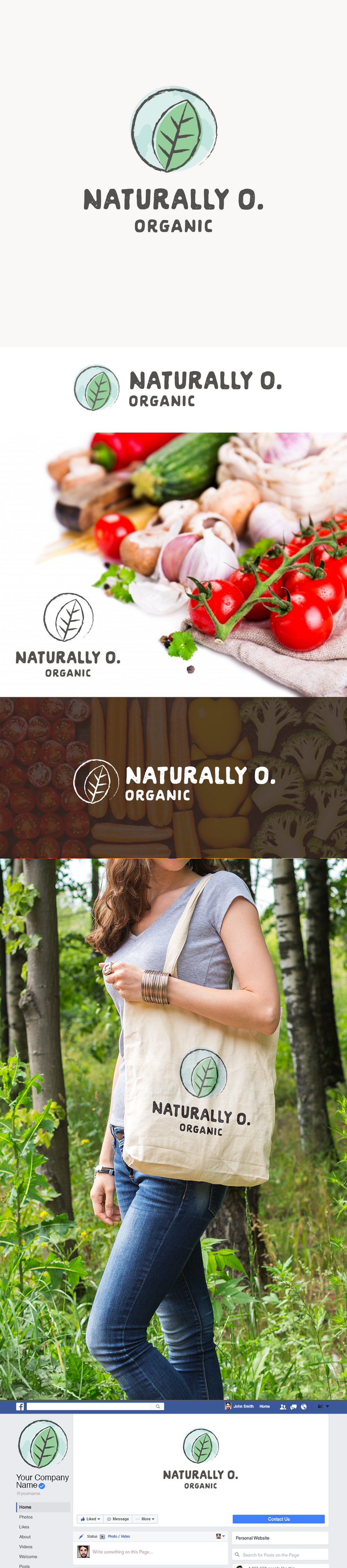
The icon starts with an "O" shape to mirror the company name, and uses a textured background to give the impression of the earth (without being completely literal about it). The leaf and rough strokes combined with the rustic typography are fitting for a company that sells organic products.