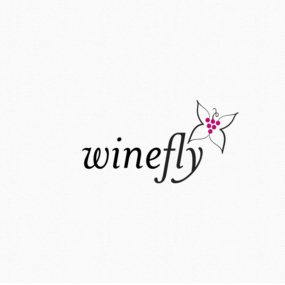
Logo concept for cosmetic company
15
Created on 99designs by Vista
The "wine fly" is not a type of butterfly, but this company sells cosmetics to women, so I took an unconventional and more delicate approach -- a simple mark with butterfly wings with grapes to represent wine as the body. Italics are not commonly used in logo design, but in this case it conveys movement (of the butterfly in flight) and relates in a lovely and elegant way to the mark.
