
Created on 99designs by Vista
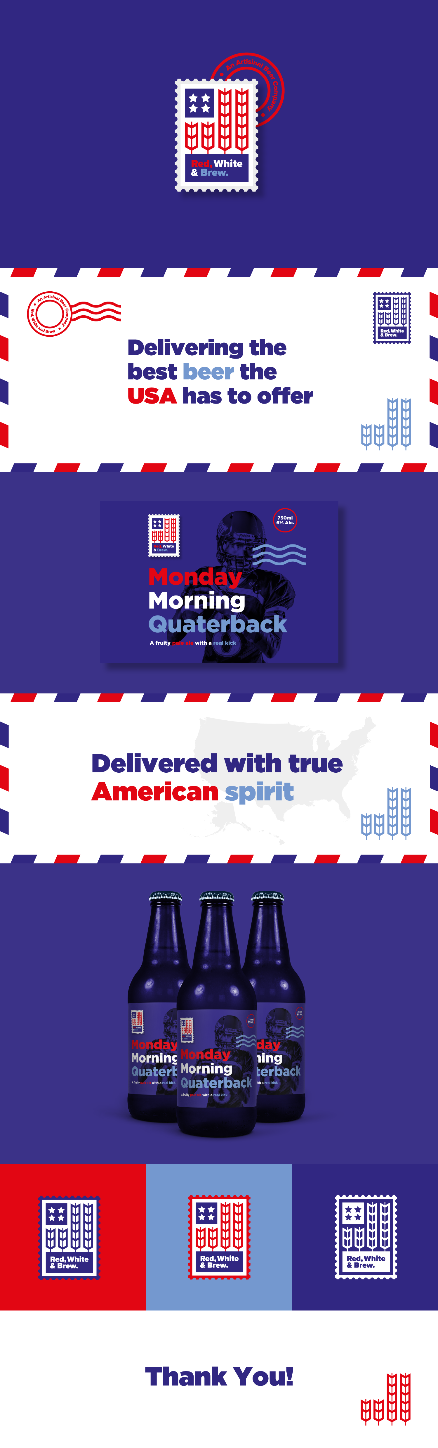
With the company name rooted in americana I wanted the logo and overall brand to reflect this. Starting with the logo I used grain iconography to create an american flag then added the icon to the front of a stamp. The reason for the stamp is to further reinforce the idea of location and place (USA), it also has an array of connotations for example, it acts as a stamp of quality and gives the brand an old world, hands on and trustworthy feel due to the link with the postal service. But most importantly it implies delivery and delivering quality beer to the customer base. Finally it opens up a wide array of iconography and concepts that if handled correctly could create a really unique and well rounded brand.