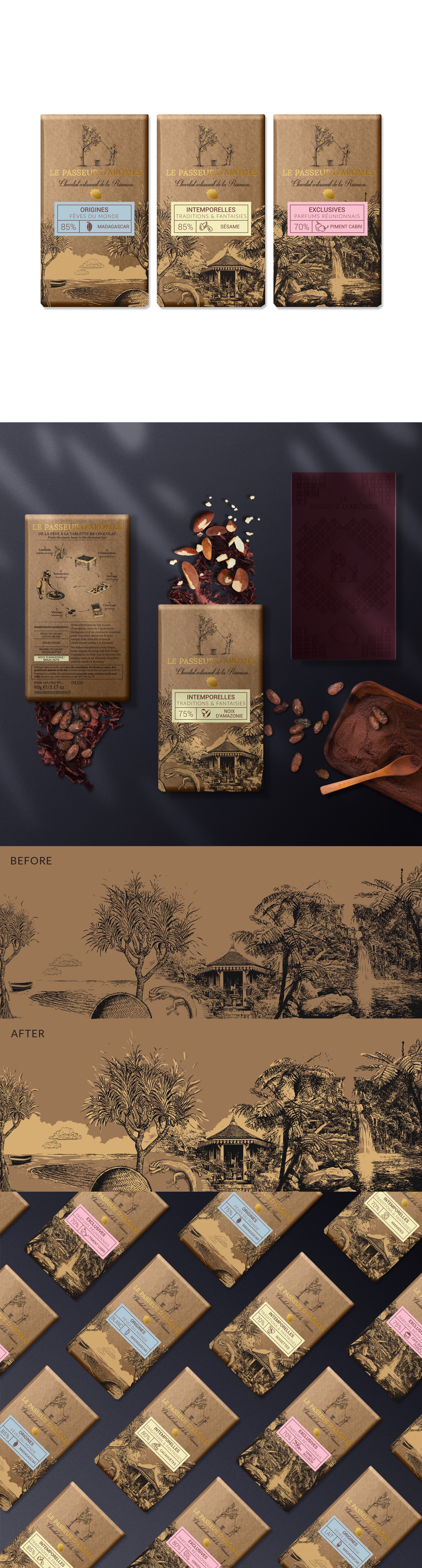

The task was to create premium packaging for traditionally made chocolate bars and the same time to keep the handcrafted feeling.
The idea was to use an illustration that represents Reunion Island, separated between the three main ranges. As the packaging is going to use a brown kraft paper, there was a need to add more legibility to the original illustration. I did that, adding a light neutral color. The colorful small labels and the flavor icons help the customer easily to make a differentiation between the three ranges and the flavors. On the back, the illustrations show the tree-to-bar chocolate making.
The author of the original illustration of the front and one of the illustrations on the back is Mrlapis. You can see more of his works here: https://99designs.com/profiles/mrlapis.
My challenge was to incorporate my illustration style with his.