Graphic comparing complex vs. simple

1
Created on 99designs by Vista
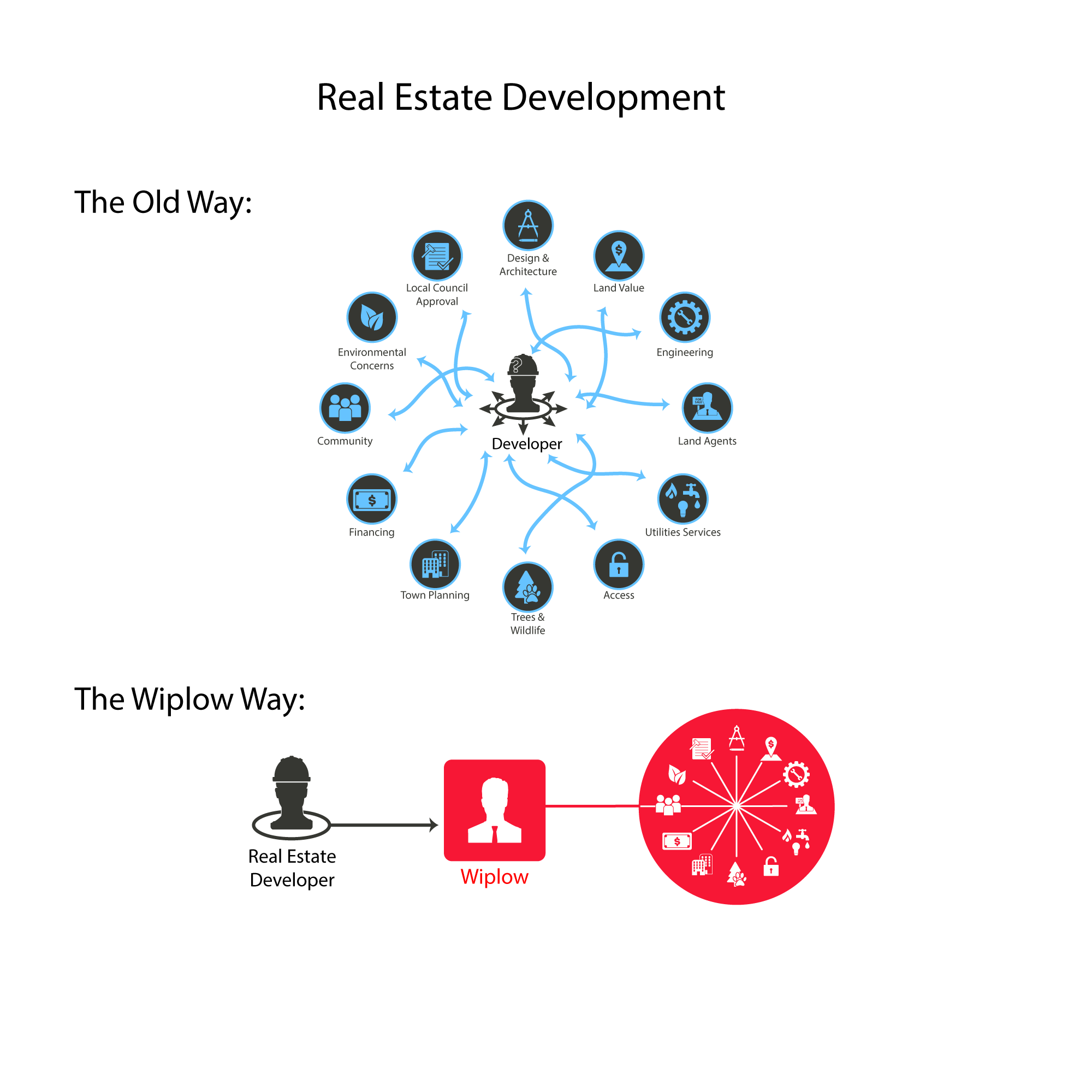
For this design, the client wanted a graphic that illustrated the difference between their simple system and the complex system that is usually used.
I created simple icons to visually represent each of the different concepts that real estate developers must deal with. I used the color palette provided by the client. On the top part, the developer in the center is being pulled in many different directions. In contrast, on the bottom, the developer only needs to go to one source to access all the needed services.
Overall I went with a very simple and clean design to keep the focus on the difference between the two concepts.