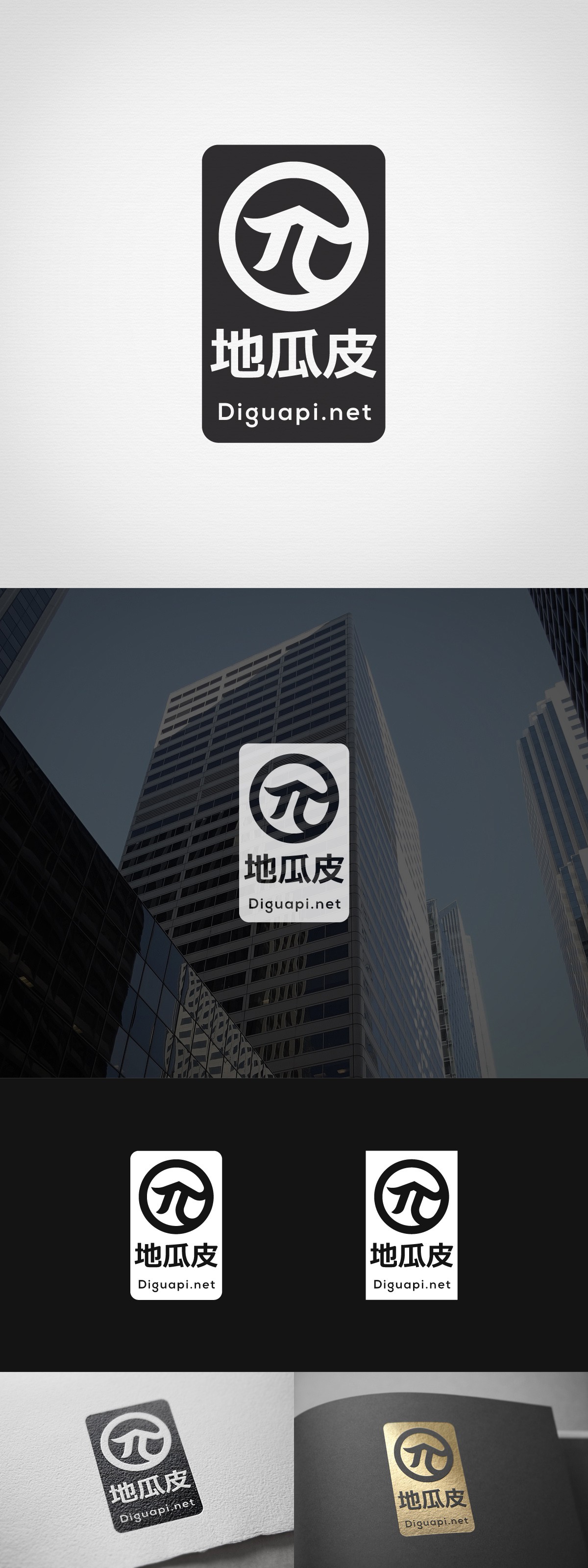
Further development of the π logo. Client wanted to include some clear association to real-estate. Top stroke of the π is broken in half making the symbol also looking like a building with a traditional Chinese roof.