Simple and sophisticated logo for adventure coaching

31
Created on 99designs by Vista
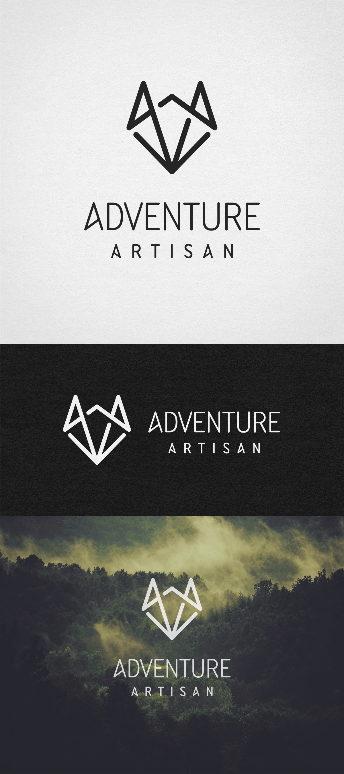
I started with two combined letters A and a south pointing compass needle to which I added lines that made the logo mark look like stylized fox head. Construction is based on golden triangle angles.
Fox symbolism is easily related and perfect match to the brand's mission and strategy. You know that old adage: “clever as a fox”.
Modified lettering feature the same shape of letters A as the logo mark.
Result is simple and sophisticated logo.
Logo is available for purchase with 1-to-1 project. You can contact me for details.