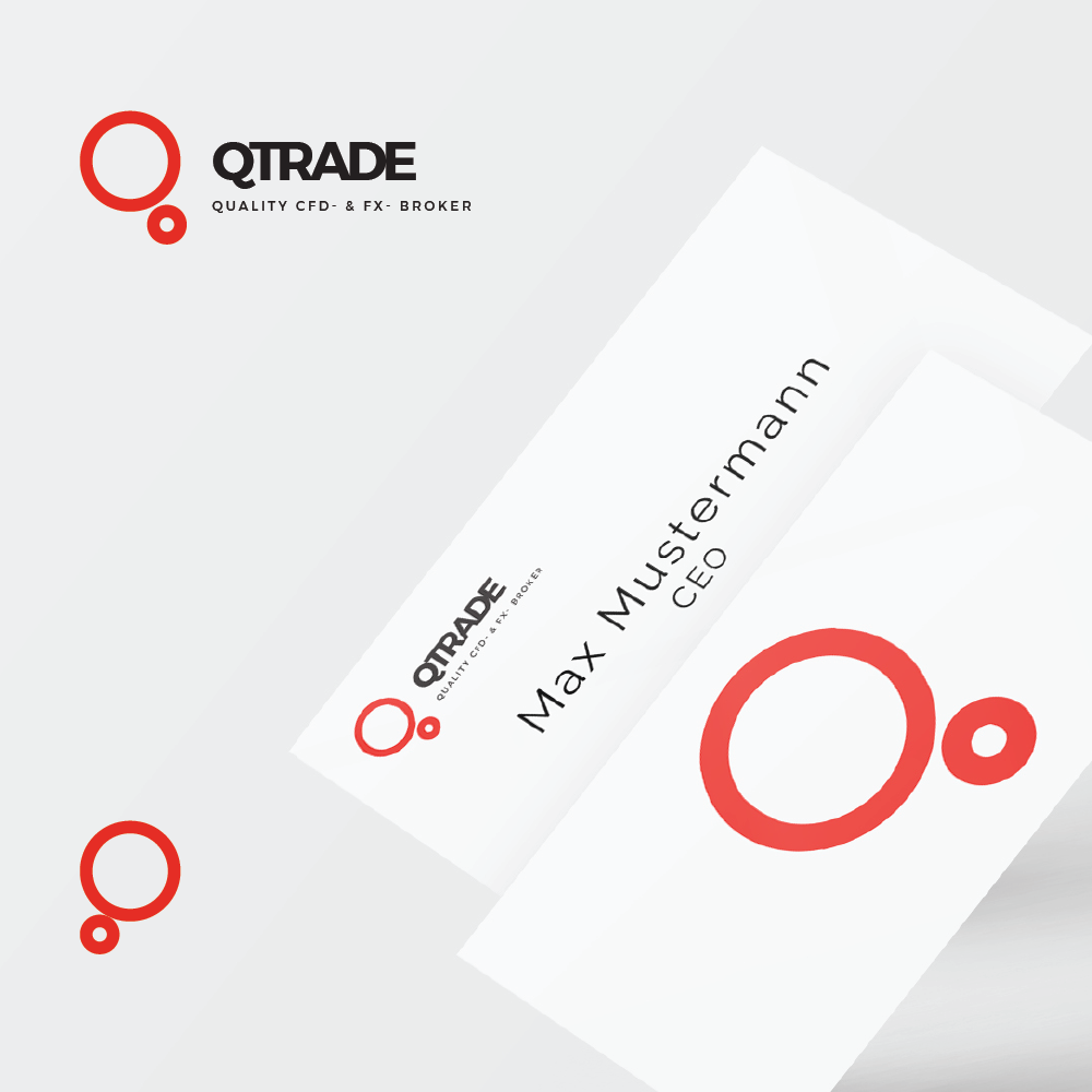
This logo was built for a trading company. they really wanted to emphasise their products having a 360degree coverage so i transformed their Q in two circles to represent that coverage, simple and elegant.