Containers filled with numbers

2
Created on 99designs by Vista
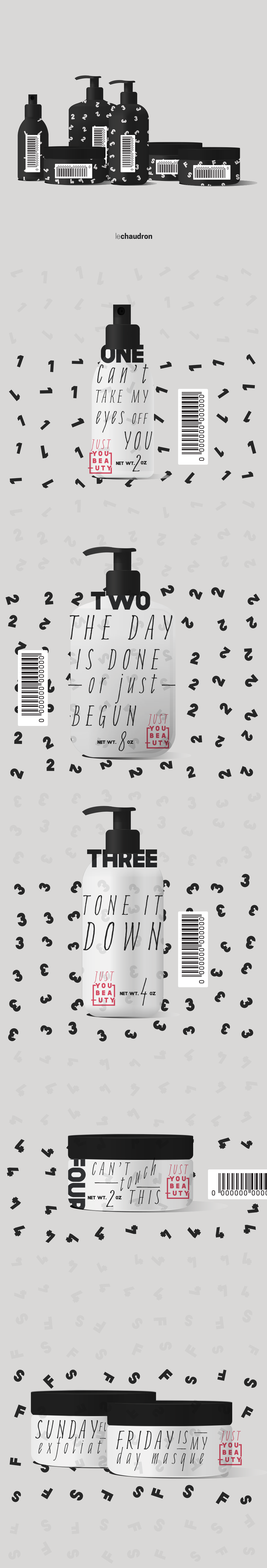
This is easy. The concept behind this are containers filled with numbers, just that, fail-safe. Just 1, 2, 3, 4, Friday and Sunday. Is what you see in the preview. Looking for a modern way, a clear pattern and a simple appearance, that denote the nature of the products inside.
Below, I have developed each package, being redundant with the numbers that are also placed next to the lid. The names are written in the same way I felt them in the brief; bold, clear and full of energy... also dramatic. I hope to express this contrast well enough with the typefaces.
Maybe it's not what one can expect from a cosmetic package, but I loved the names and it turned out that way.