
Created on 99designs by Vista
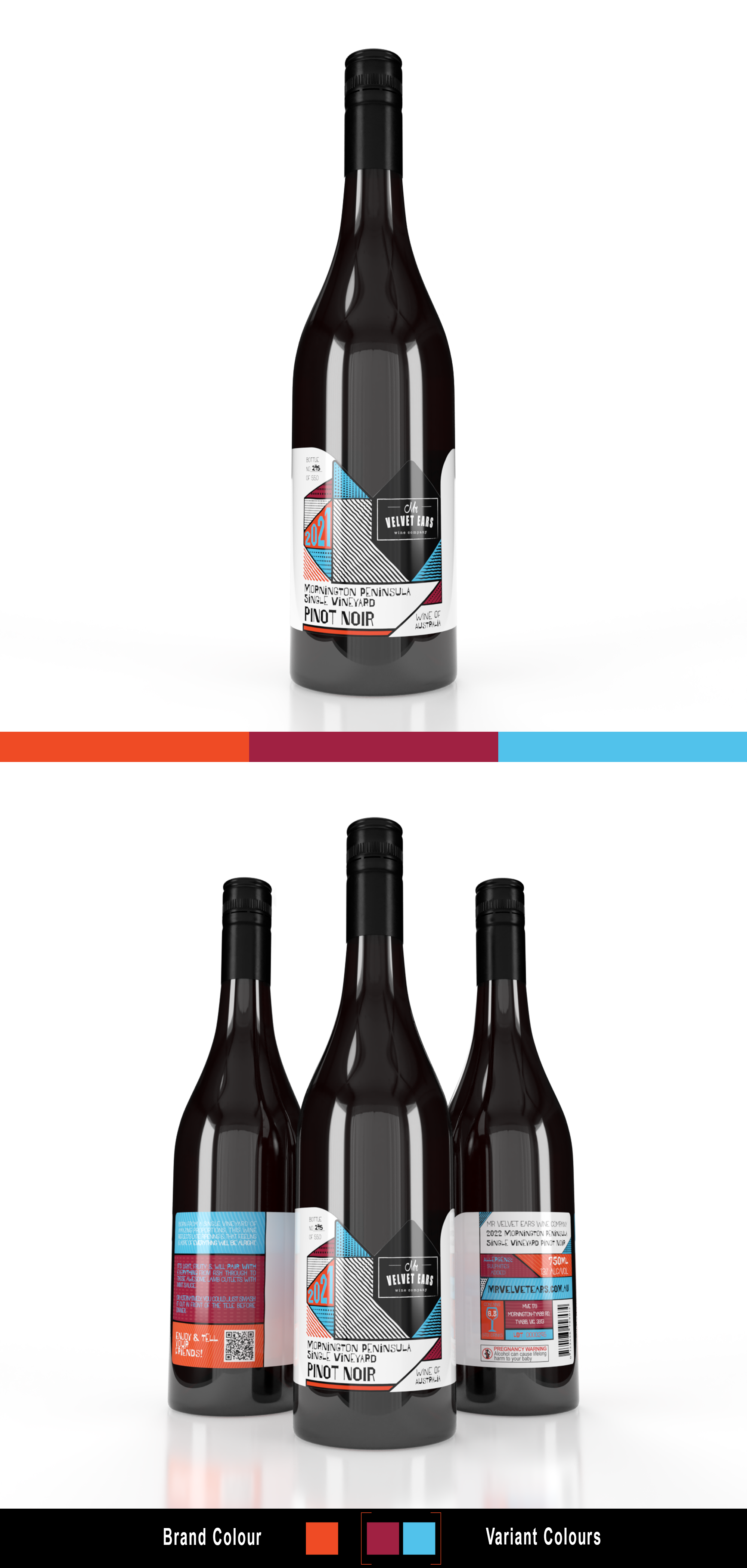
The brief was for a re-design of the brand aesthetic in order to allow for a more consistent and recognisable wine offering, whilst still ensuring that each varietal and vintage had a unique identifier.
The brand is a unique Australian wine brand built on the belief that “Wine ain’t that serious” and with a goal of making the wine experience approachable.
This concept uses geometric shapes in a nested composition, and by changing the placement of the nested shapes and patterns, along with colours for each varietal, this would ensure that each varietal would have a unique identifier, yet still fit in with the brand aesthetic.