Bold and modern logo design for a Rifle Match

1
Created on 99designs by Vista
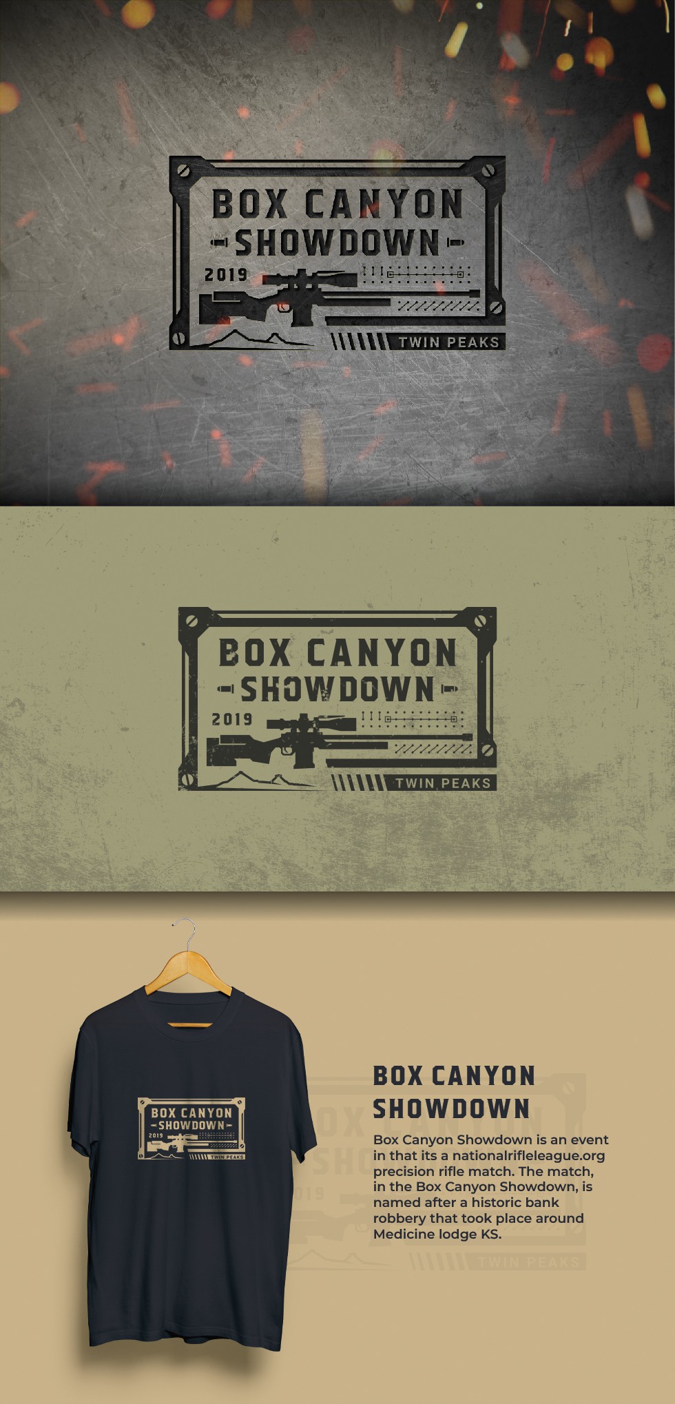
The design uses sharp angles and straight lines to denote a bold and energetic stand in the design process. The precision rifle and the name of the match take the center stage in the logo and are accompanied by other design elements to create a bold and mechanical aesthetic. The colors are a direct derivation from the military color scheme and are selected to ensure maximum contrast, and as a result, maximum readability. The result is a unique logo design that perfectly communicates the aesthetics of the match and works well in dark and light backgrounds.