Client description:
"We need a logo designed for our ad agency website. We already have one but we're going for a different look and feel. The website is makersmedia.com.
• We want to be taken seriously and want a more serious look (nothing cartoony).
• The logo doesn't have to be a specific color or set of colors, but the existing logo is Red (if it looks amazing and isn't red, that's cool). We've discussed a classier look using black and white, but aren't sure.
• Modern noir look, black and white/silver"
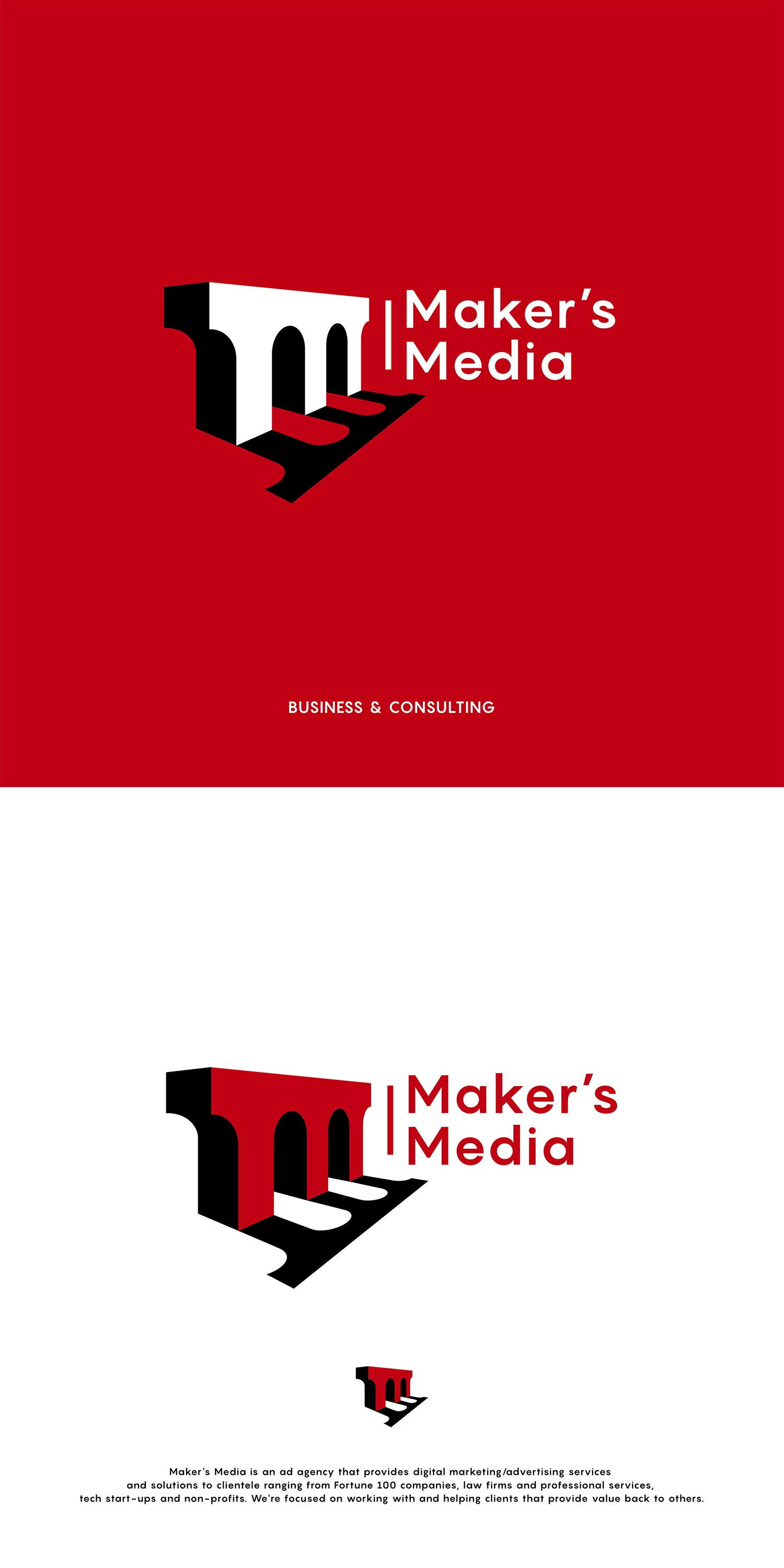
My first idea was to present the double letter m through an illustrative solution. The most adequate solution for such an idea was a bridge in the shape of the letter m. The bridge represents the future, the path to success and prosperity, a new beginning, building success etc.
The logo is modern, simple, illustrative, recognizable and exudes a sense of confidence and trust.
The bridge pictogram is hand-drawn
