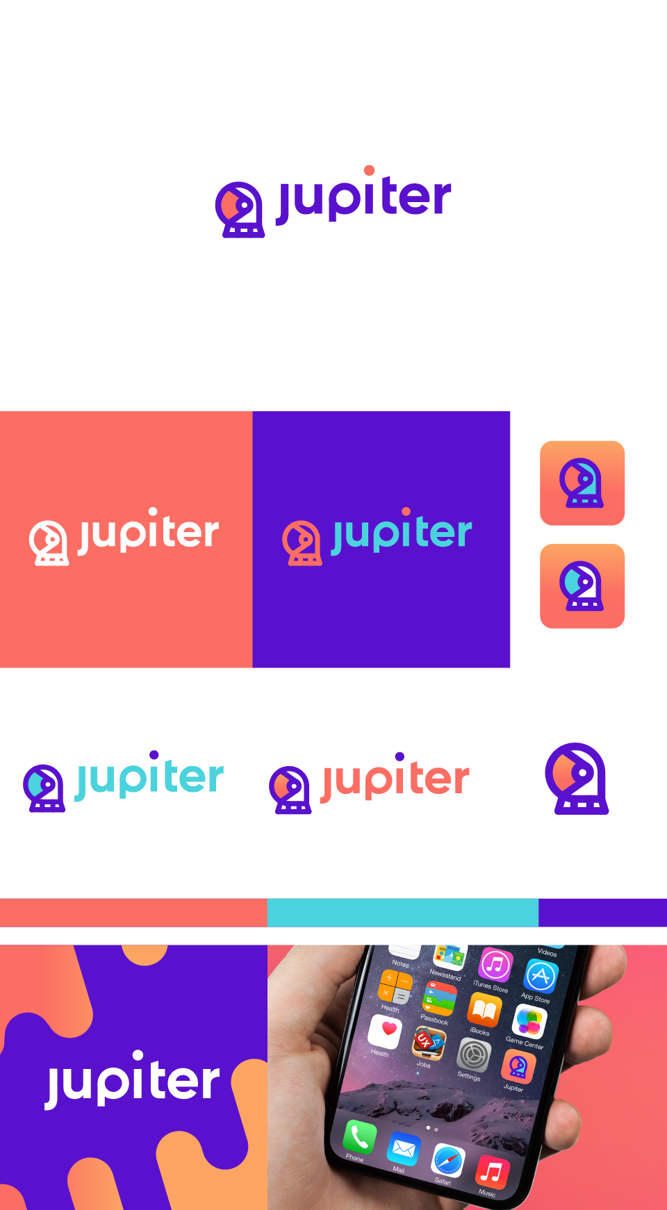
Jupiter - a digital bank for millennials

0
Created on 99designs by Vista
Looking at the landscape of designs aimed for millennials, logos that operate well are usually minimal and brightly saturated - this ensures that they're read well on the screens of phones and devices. Keeping that in mind, I decided to craft this logo while playing on the nature of setting out on a path. I used an astronaut to be a symbol of growth, achievement, and exploration similar to the characteristics one would have in exploring their own financial universe.