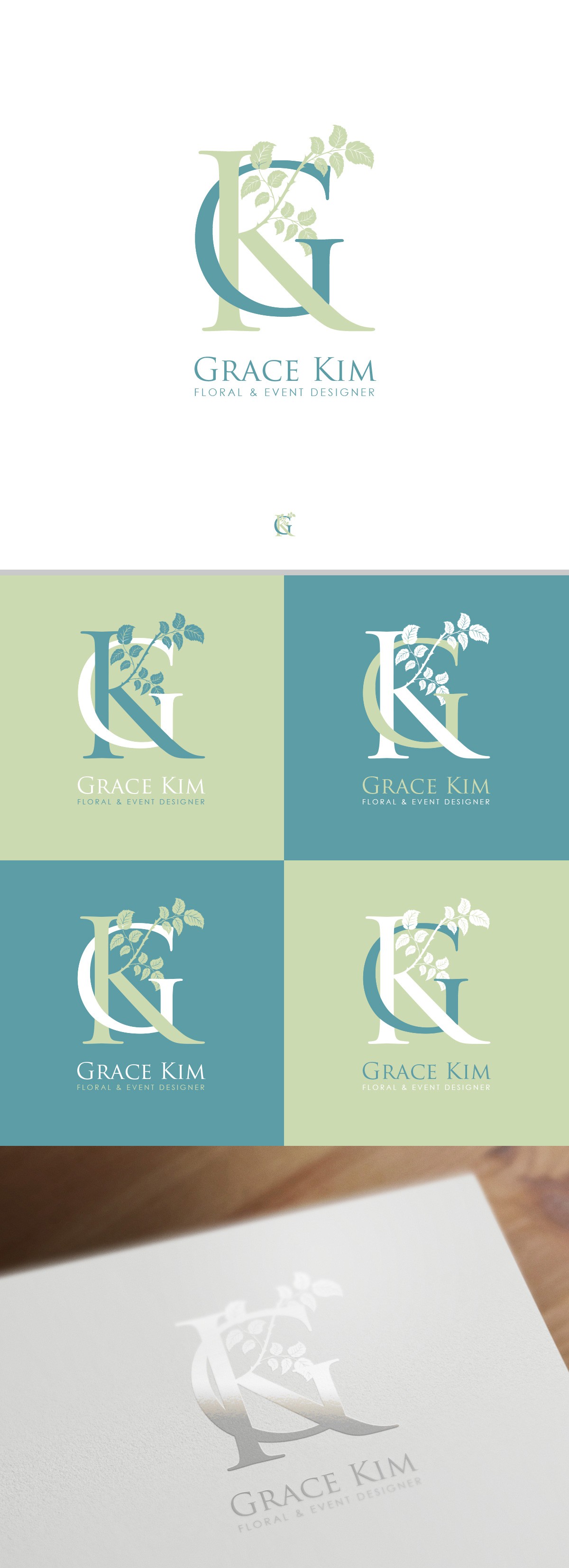
Logo proposal for Grace Kim Floral designer.

0
Created on 99designs by Vista
Inspired by the monograms in wedding and event cards, the "touch" here is the green arm of the letter "K", is elegant, simple and keeps a little of the old and yet classy typography of the former logo, bellow there are some color palettes applied and a mockup on silver ink.