
The Best Bee Hive is an economical combination of the most forward-thinking bee hive components that makes it easy for anyone to become a beekeeper. It's not only the best habitat for bees, but it provides the best honey and best bee-keeping experience.
The main concept of my logo is what the other contestants did not notice it even if clearly stated in the brief.
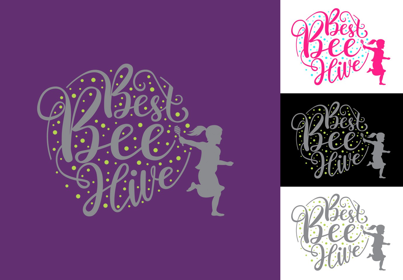
First, feminine.
I use elements that are so feminine, handwriting style and silhouette of a little girl.
Secondly, not just about honey, it's best bee-keeping experience too.
The little girl who ran freely carry honey stirrer, beside easily associated with honey, I want to emphasize 'best bee-keeping experience', especially the 'easy for everyone'.
Thirdly, simplicity.
I use colors that is easy to implement on any background. My logo is also very easy to change the color for a variety of adjustments.
Fourth, unique.
Yes, I do not use black and yellow and the image of bees.
Hope you like it.