Logo required for homemade churro business

12
Created on 99designs by Vista
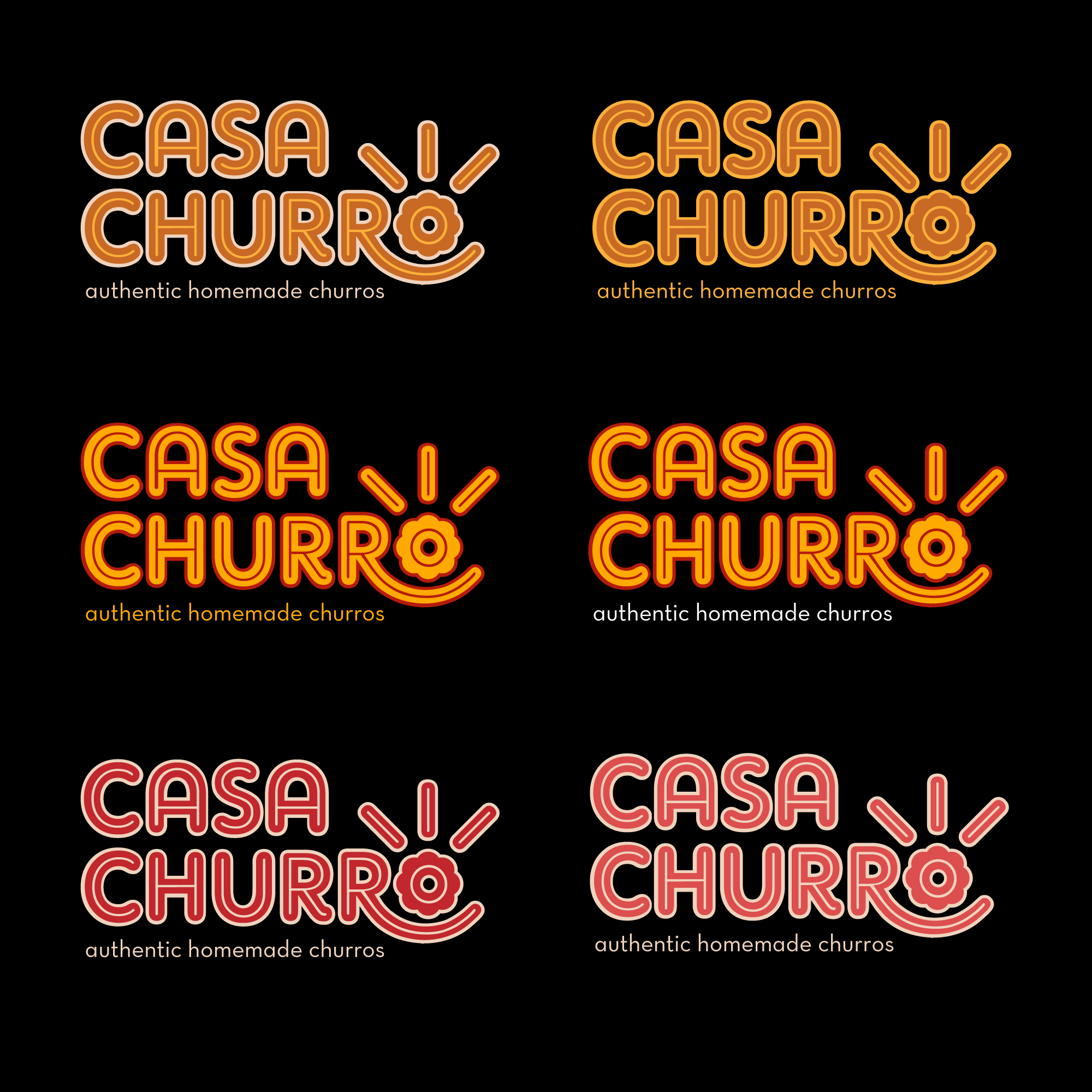
The logo itself looks like a churro, where the inline represents its filling or its textured shape. The letter "o" turns either into a chocolate dip, where the churros move towards, or into a churro seen from the top. It's a fun and modern design.