
Created on 99designs by Vista
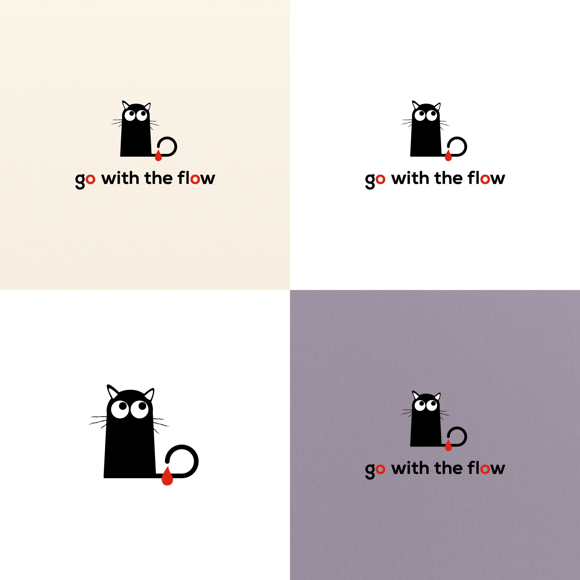
This logo concept is for sanitary products and the brief called for a fun, edgy design with spots of red and possibly a cat. At first glance my cat looks innocent enough, but it's actually shaped like a tampon. The red letter Os in the name are a subtle reference to the cyclical nature of menstruation, and the 'oh!' many women feel when it's that time of the month again.