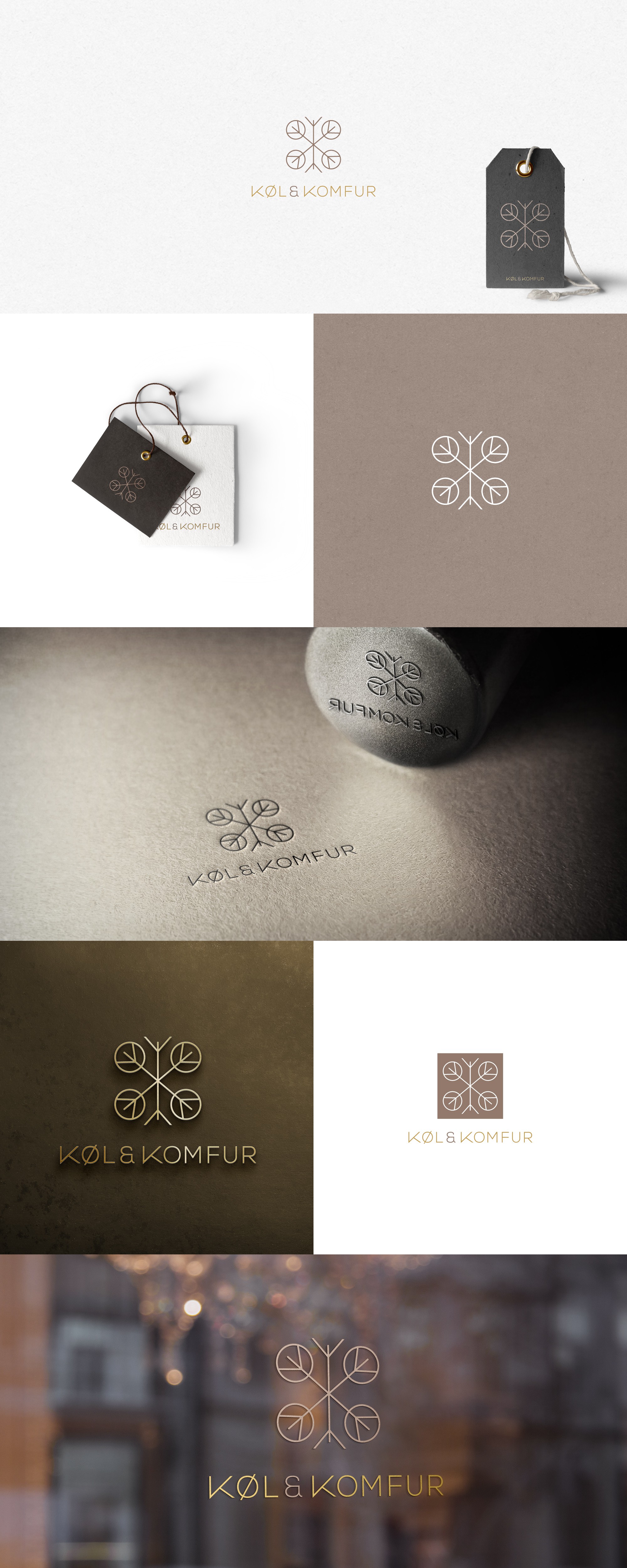

This retail store specialises in selling luxury secondhand kitchen appliances such as stoves and fridges. I wanted the logo to represent both the products for sale as well as the environmental benefits of buying secondhand goods. I combined three elements to create the logo: a gas stove top (four circles) + a snowflake + two letter Ks (part of the snowflake). The snowflake, which represents a fridge, is also a reference to nature, which makes the link with the environmental aspect of buying secondhand. To complement the minimalist graphic I used a simple modern font. I chose earthy, sophisticated gold/brown tones for the design to further reflect the link with nature and the environmental benefits of buying secondhand. As well as retail tags and shop window, the mockups provided show how the logo could be translated into metal for use above the shop door.