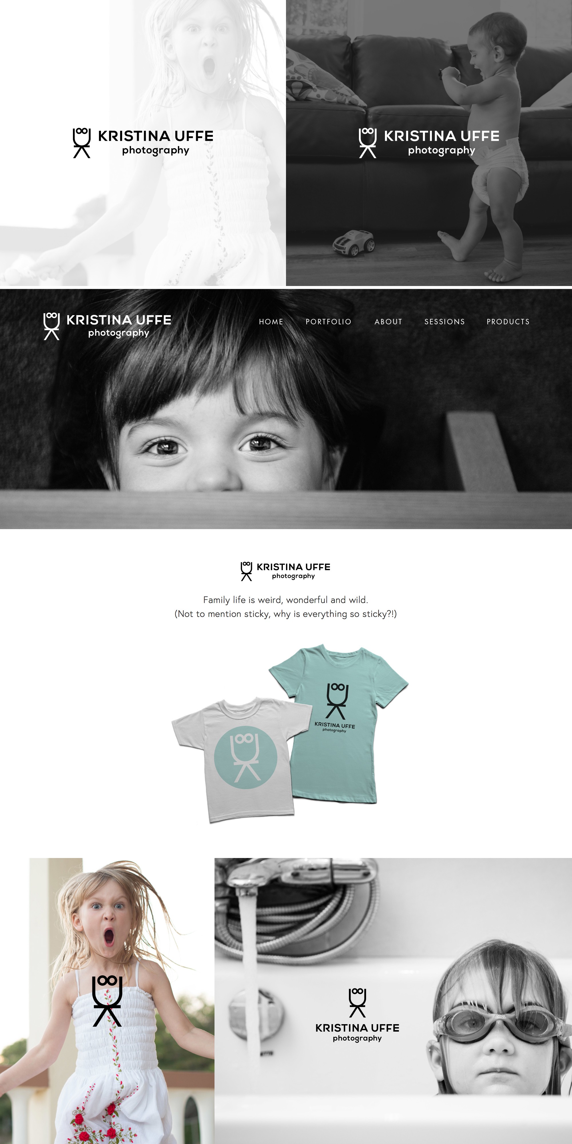
Kid-friendly logo design for a family photographer

57
Created on 99designs by Vista
I wanted to visually convey that the client specialises in photographing children. By rotating the letter K, to form a pair of arms and legs, placing U on top of it to form a head, then adding a pair of 'eyes', I was able to create a very simple 'child'. The logo is a perfect fit for the photographer's website, with its minimalist black and white design and playful tone of writing. The client plans to use the 'child' from the logo for stickers which can be given away to her young clients.