
Created on 99designs by Vista
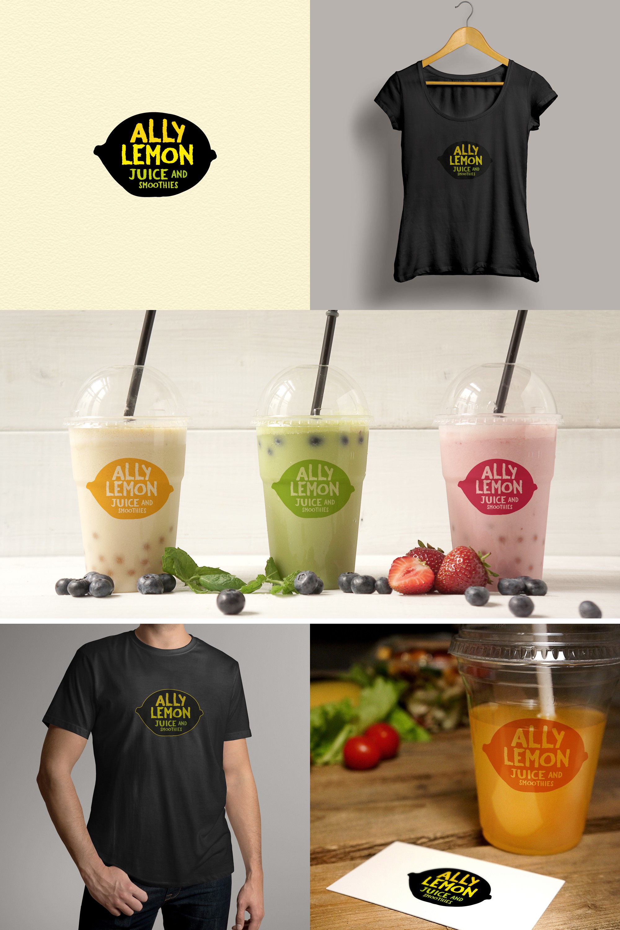
For this strong simple logo I deliberately made the lemon a bit wonky as I wanted the overall look and feel to be friendly and approachable, as opposed to perfectly constructed and too slick. The 'chalky' font complements the naive style of the lemon and suggests handwriting on a cafe menu board, while still being very easy to read. Instead of opting for a yellow lemon, I chose to make it black, so that the bright yellows and greens of the text really 'pop'. The logo works well printed in a range of single colours, chosen to highlight/complement the flavours of the juices and smoothies shown.