Concept for marine thermostat company

1
Created on 99designs by Vista
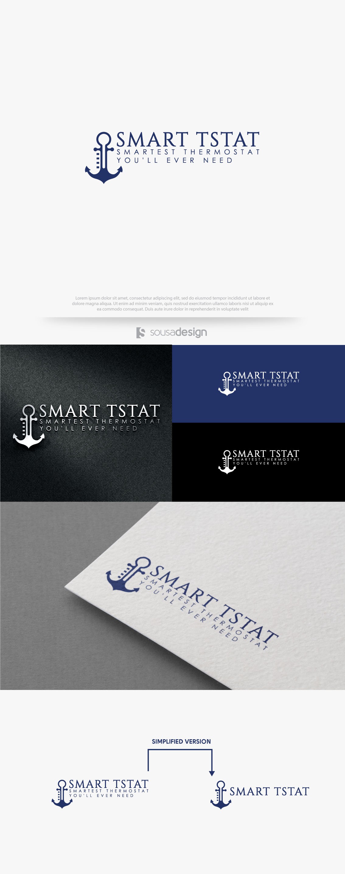
The logo is basically the union of a thermometer with an anchor (
Representing the maritime segment).
I chose a serif font because the customer said he wanted to convey luxury, sophistication and class.
Because it is a brand that produces equipment for the nautical segment, I decided to use the color navy blue. According to the psychology of colors, blue conveys tranquility as well.