Modern delivery of Arab food

3
Created on 99designs by Vista
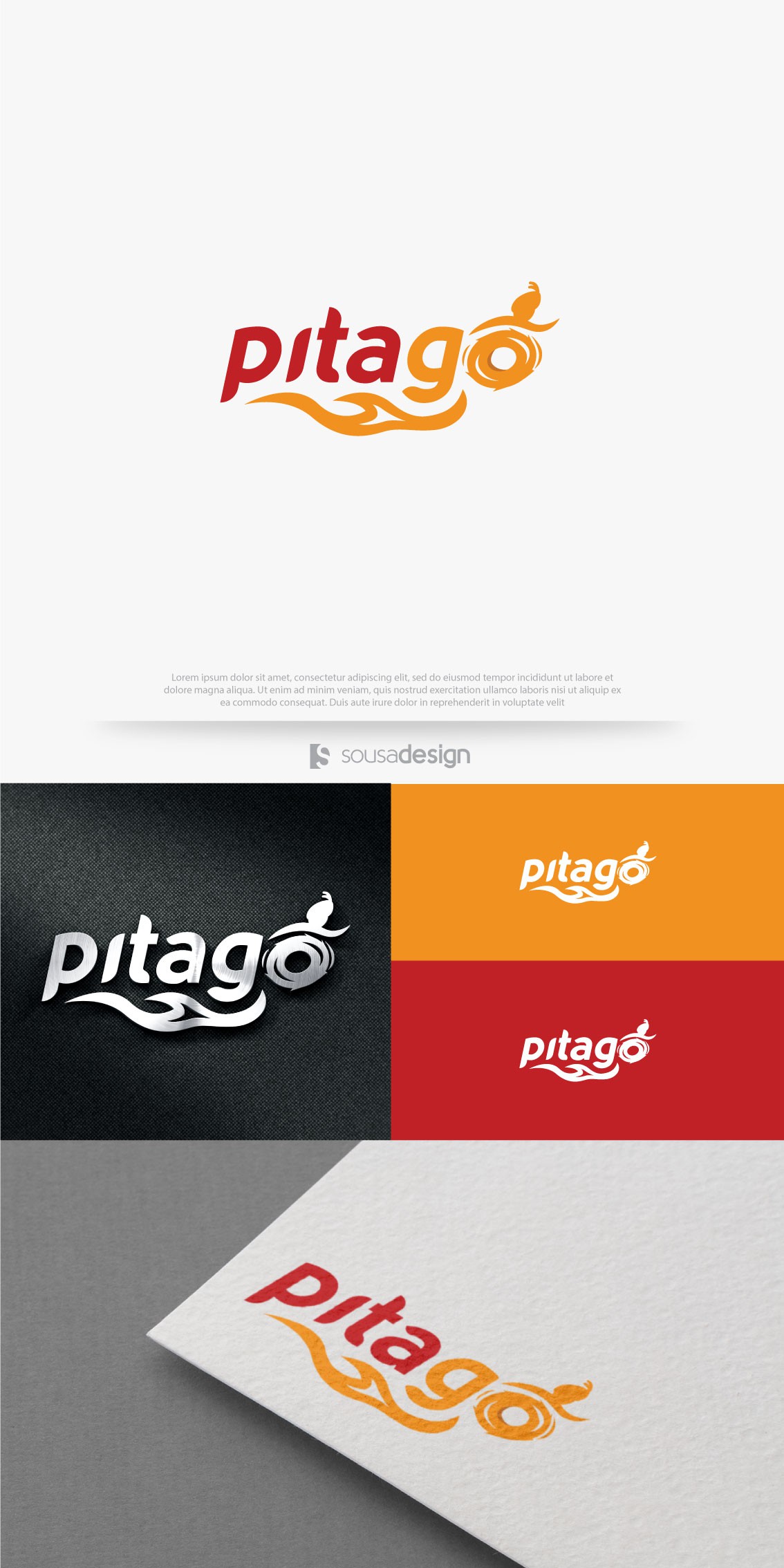
The main idea of the logo was to stylize the letter "O" so that it would look like an Arab running. I also added a flame in the logo, which can represent both the speed and the spicy feature of some foods.
The source was designed to be both modern and reminiscent of Arab culture. However, the greatest focus was on modernity, since the target audience of the client is the millennium. It is italicized to convey speed.