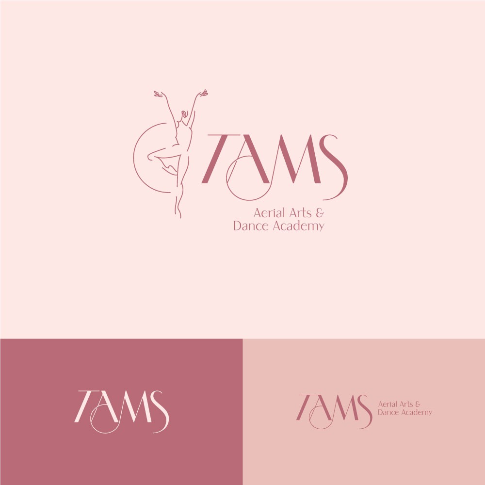

Logo for a Aerial Arts & Dance Academy.
The idea was to play with the lines of the wordmark. I wanted to separate the two thinks to make them navigate independently.
The symbol is clear and very descriptive, however, the wordmark tries to draw a harmony of forms related to the feeling that you want.
Circles are consistent. This can make that business appear more reliable. They also represent your work tools (rings, pilates balls, etc.). In the psychology of logo shapes, circular designs are often used to portray a “feminine” essence.
Furthermore, I make a curved movement in your logo to create a more flowing design through typography. The flowing, creative elements of the image seem to denote warmth, movement, and community.
At the same time, the use of diagonal lines on the brand is a representation of activity.
And, at least, the lettering style features a modern elegant style.
I hope you like it.
Thanks.