zib cube (finalist)

2
Created on 99designs by Vista
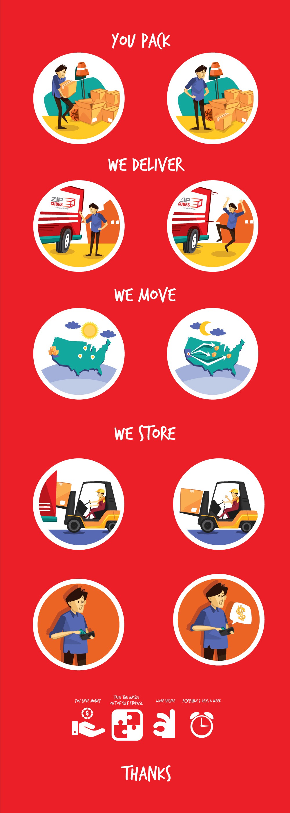
i make some movement icon in the website zip cube. simple and friendly is the highlight to describe my design concept, as the brief explained.
In my view, the concept have fresh and youthful spirit
I think the best illustration of zib cubes website will be fit in funny and popart style. This will maintain simple, clear, and familiar character.
and then for icons i'm making pictogram icon. why i choose this style? because picto don't have much shape but easy to
understand and easy to aplicate in the other background.