
Created on 99designs by Vista
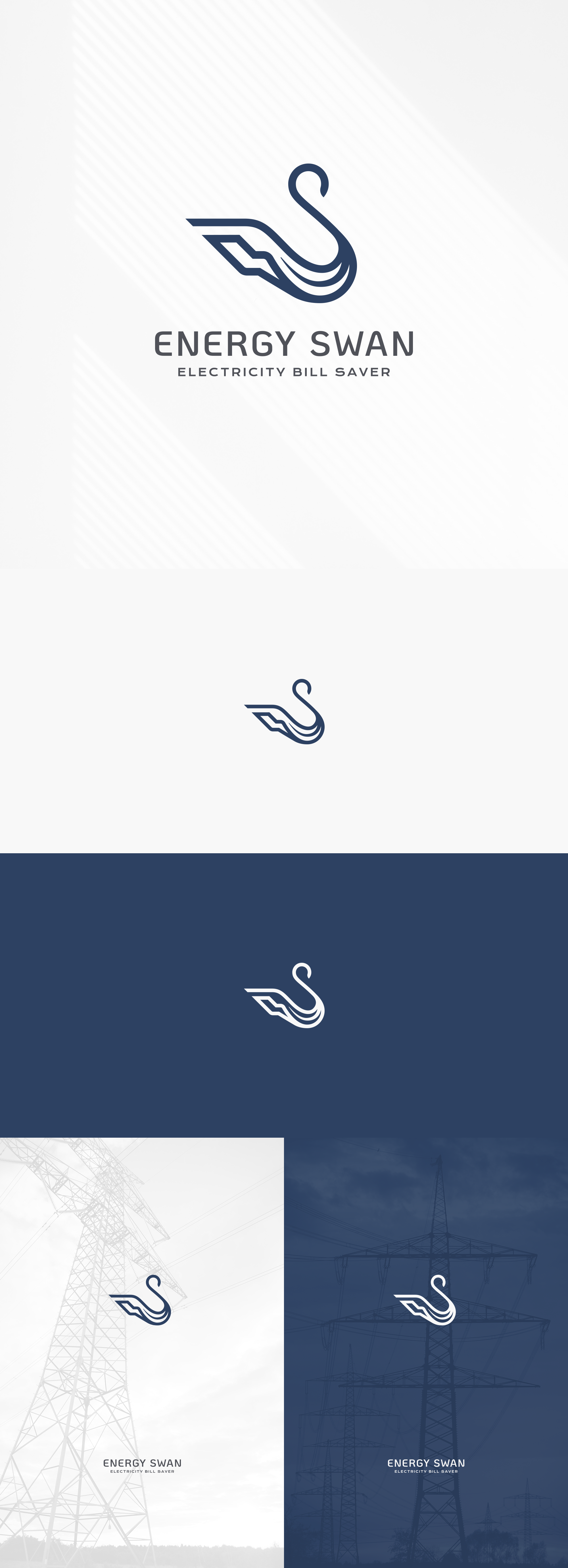
Logo design for a future energy company focused on more friendly practices with the environment and specifically with the local population of swans around the area.
Fusing the basic shape of a swan and the energy concept, we have an isotyope that represents both ideas, using soft curves for the organic element, the swan, and geometric, strong angles for the energy section.
the font has a slightly futuristic style, perfect for a future company that wants to make an environmentally friendly change in later years.