
Created on 99designs by Vista
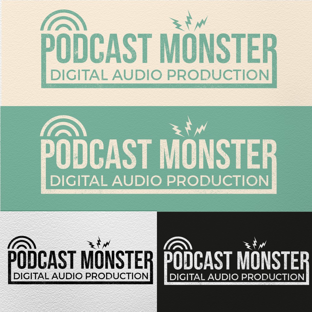
The client wanted a 1940's style logo for a digital audio podcasting company. the colours i used are to me classic 40's, i applied a overlay to give it a slighty worn look reminiscent of old newspaper type. I used the two different elements over the '0's one to represent the podcast going out and the other to hark back to old radio tower graphics as well as playing o the monster idea.